In these uncertain times (I had to start with that for my professional writer pandemic bingo card), we are all looking for signs. Signs that things are getting better. Signs that we will actually love the new normal. Signs that we can start doing some of those things we took for granted before.
For SIE, some of our signs are actual signs.
A welcome graphic greets visitors to Smithsonian Exhibits’ building in Landover. SIE designed and fabricated the graphics and the metal sign holders.
The New Normal
The Smithsonian recently reopened the National Zoo and the Udvar-Hazy annex of the National Air and Space Museum. (For those of you not in D.C., Udvar-Hazy is the museum building near Dulles airport.) In order to reopen as safely as possible, the Smithsonian has made some changes to how people can visit these museums. It’s still free to visit, but visitors need timed passes. Visitors over age six need to wear a face covering. Everyone needs to maintain at least six feet of distance.
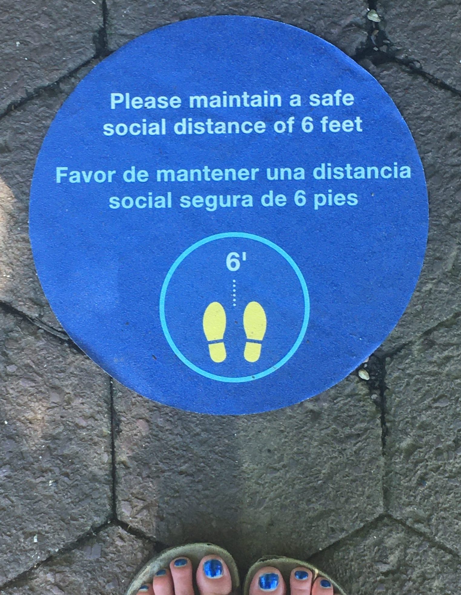
Signs on the pathways at the National Zoo serve as a good reminder to keep socially distant.
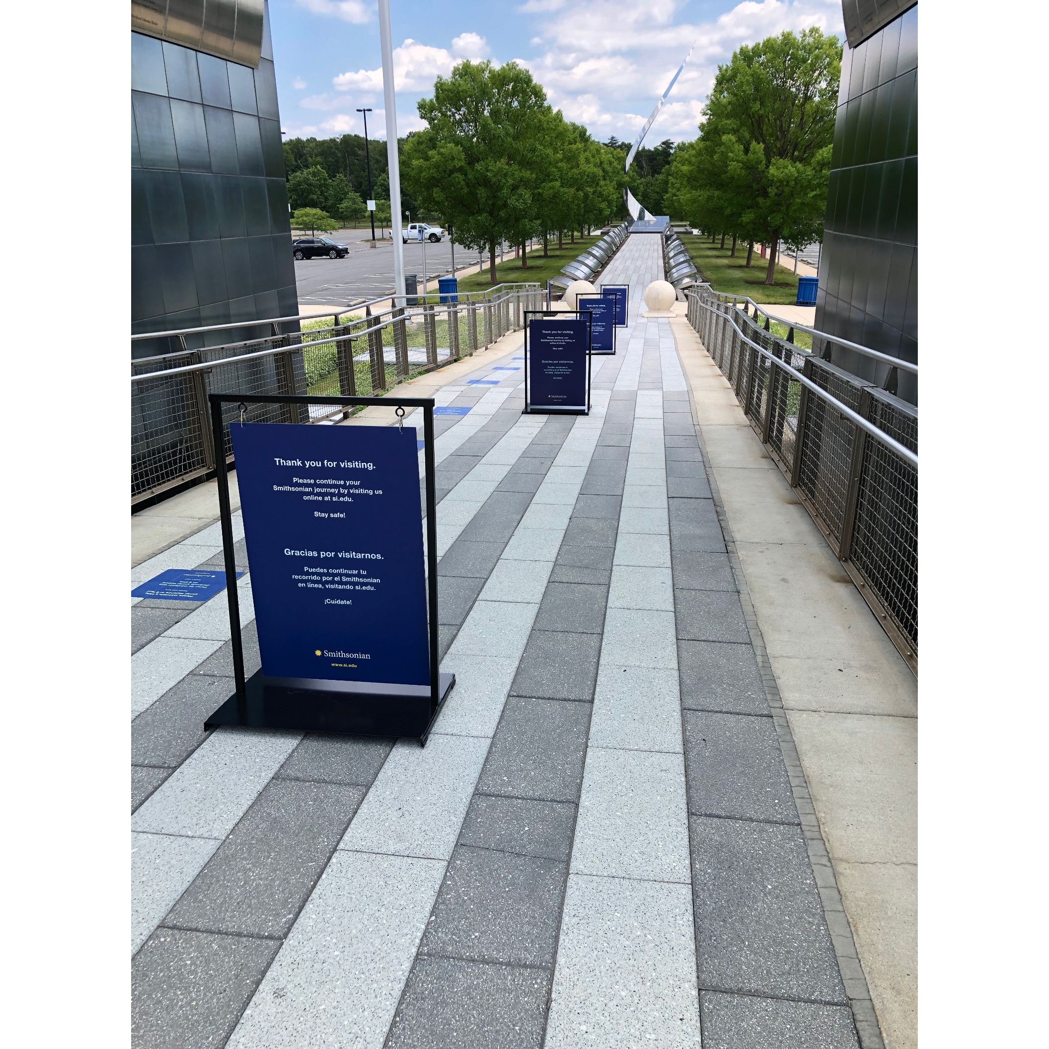
Signs at Udvar-Hazy thank visitors for coming, and create a divide that allows for one-way entry and one-way exit. Signs reminding visitors to maintain six feet of distance dot the side of the path leading into the museum.
Reopening Efforts
This is where Smithsonian Exhibits comes in. We are, first and foremost, here to serve the Smithsonian. Our expertise normally goes into making one of a kind exhibitions, but for this effort we refocused and became the Smithsonian’s one-stop shop for reopening graphics.
Madeline Wan, an SIE graphic designer, developed icons and graphic standards for the reopening effort. Our fabrication team designed and manufactured metal sign holders. The holders suspend the graphic in a frame. (This prevents strong winds from knocking over signs.)
Madeline also created signage catalogs for the Smithsonian museums and stores to use when ordering their signs from us. It’s a win/win/win: It’s easier for the museums to get their signs in place; the Smithsonian as a whole will have consistent signage across all the museums; and that means it will be easier for visitors to navigate the reopened spaces even if some of the pathways through those spaces have changed.
Our project managers have been meeting with the museums as they assess their reopening signage needs. While each museum is responsible for determining their reopening plan, we are glad that we are able to provide this service and make that effort a little easier.
Safety First
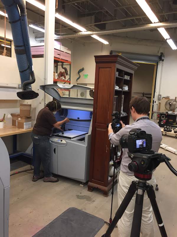
And don’t worry, we practice what we preach: SIE has set up our fabrication and graphics shops to maintain distance between colleagues. Everyone is wearing face coverings. In some cases, this isn’t really a change: some of the work requires face covers and respirator masks already.
Those who can work remotely are continuing to do so—because fewer people in the building makes it safer for those who are on-site.
In short, the Smithsonian is taking precautions, and at SIE we are helping each other out however we can both in our spaces and throughout the Institution.
Want to visit?
When you’re ready to spend some time with animals or a space shuttle, we’ll be here. Just remember to wash your hands.
Blocking off every other sink helps maintain social distance. And remember, washing your hands is generally a good idea, even in non-pandemic times.
If you’re ready to visit, check out https://www.si.edu/visit for the most up-to-date visitor information and to reserve free timed passes.
If you’re more comfortable waiting a bit longer before venturing to the Smithsonian, https://www.si.edu/ has a variety of online offerings.
If you’ve ever wondered why SIE sometimes has longer breaks between blog posts, there’s a very simple and logical reason for that: we aren’t professional bloggers. We have other jobs at SIE, and those responsibilities come first. So, while we love to keep people up-to-date on the blog, working on the exhibits is more important than writing about working on the exhibits.
The blog posts are, for the most part, written by SIE’s exhibit developer/writers.
This is where I realize there’s a pretty good chance that a lot of people reading this are thinking:
What is an exhibit developer?
Well, like a lot of jobs, it really depends on where you work. At SIE the exhibit developers are also writers. In some places, the exhibit developers are also project managers. I’m sure there’s countless combinations out there that museums developed as they figured out what works best for their process. And as always, if you work somewhere small, the position descriptions get to be somewhat all encompassing. One of my earlier jobs included (among many other things) exhibit research, script writing, bookkeeping, and on Thursday it was my day to take out the trash. My point is, there’s no one-size-fits-all exhibit developer job description.
Because the SIE exhibit developers are also writer/editors, we have a variety of projects that come our way. Everything from copyediting completed scripts to developing and writing an entire exhibit from the ground up. But most people have a sense of what a writer does … for example … this thing you’re reading now? I wrote it.
Exhibit developers, however, are one of those jobs that probably didn’t come up with your high school guidance counselor. I ended up in this field and I didn’t know it was a job until I was in an internship in college.
There are a few key roles, though, that I think define exhibit developers at SIE.
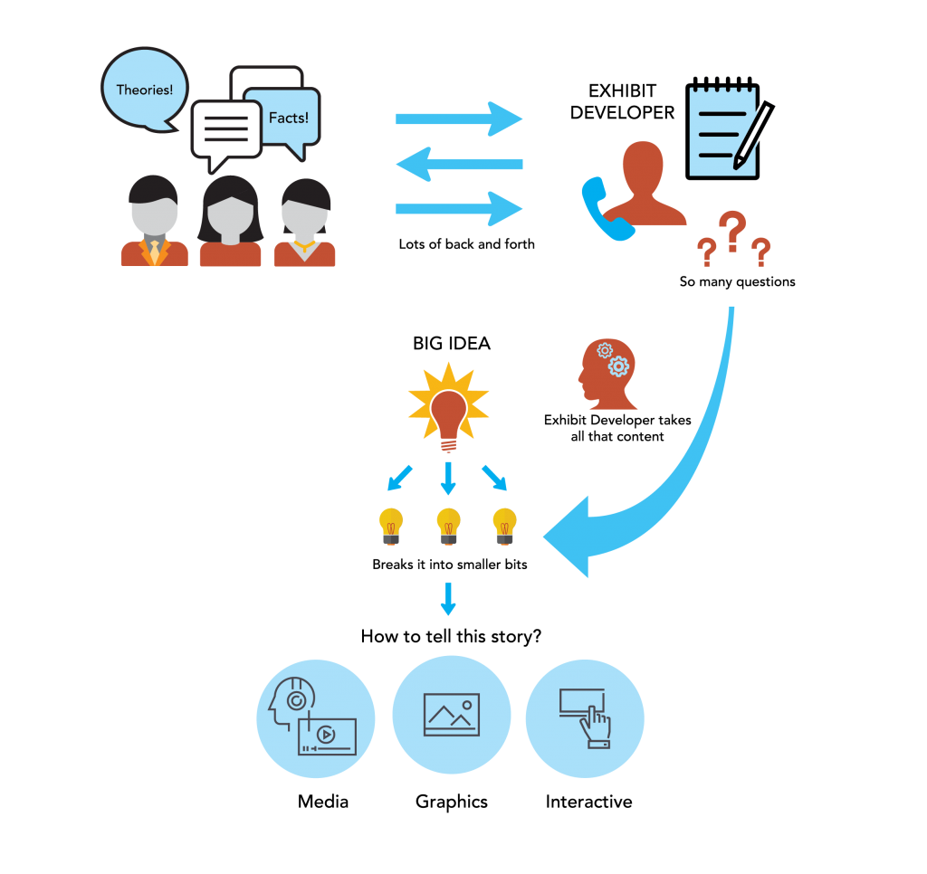
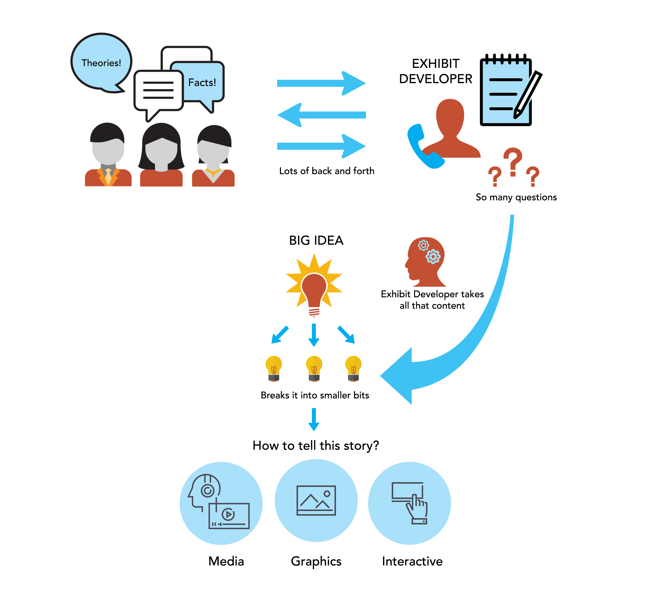
Content Wrangler
Content Wrangling: We ask to the “dumb” questions so you don’t have to. (Graphic by Madeline Wan)
Exhibit developers are content wranglers. We work with the subject area experts to figure out the best way to tell their story. This way the subject matter expert (for example: historian, chemist, anthropologist, special agent, civil engineer, horticulturalist, etc.) can provide all the information (and review the exhibit script for accuracy), and let the exhibit developers figure out how to turn that into a holistic experience for the museum visitors. Sometimes that means we do some of the research, other times, someone hands over source material. Most of the time it falls somewhere in between. There’s always a lot of back and forth with the content experts as we figure out ways to explain what they know to an audience unfamiliar with the topic.
Script Editor / Writer
Scripts: We help get the text into an easy to understand format … or write the whole thing if the subject matter experts don’t want to. (Graphic by Madeline Wan)
At SIE, we might help edit the script, or in some projects, like The FBI Experience or Mission: DIA, we write it ourselves. We also have to keep in mind that visitors might not know much about the topic. Museum writing is different than writing an article or a book. We need to write in a way that is understandable in more than one order. The main thing to consider when writing for an exhibition is that museums are a spatially driven experience. Visitors move through an exhibition. Museums aren’t textbooks (for a lot of reasons) but let’s concentrate on the order of information for now. In a textbook, it’s fair to assume that the reader will read the chapters in order. By chapter 4, the author can expect that the reader at least glanced at chapters 1 through 3. Exhibitions work more like an anthology: the ideas are all connected, but if you skip around, it should still make sense.
We still make sections clear so visitors can see when they are moving into a new topic. But, while a building’s design might dictate how a visitor gets from one gallery to another, there is no way to guarantee that a visitor will go through the space in any particular order (and even if they do, they might not have a chance to read everything along the way).
Visitor Advocate
We you, visitors. You’re always on our minds. (Graphic by Madeline Wan)
We think about visitors. A lot. We heart you, visitors. We try figure out how a visitor would navigate an exhibit. Would they likely follow it in an order? Is there a place where they might have to wait (for example, at an interactive element)? What if that went through it and only looked at the objects? Could they still get a positive experience? What if they only looked at the pictures and read the titles and captions?
Ideally, we like to think that visitors will read everything, and do every interactive, and watch every video clip. But we also live in the real world and understand that sometimes the kids are just done and you have to leave. Or you were lucky enough to have an extra 30 minutes one day and popped into a Smithsonian and just wanted to see something you hadn’t seen before. We want you to engage with the exhibit however works best for you on that visit. Walking into a gallery, sitting on a bench, and enjoying one piece of art is a fantastic way to experience a museum. So is reading every panel if that’s what you want to do. Museums are for everyone, and exhibit developers want you to have an experience that works for you.
Also, we want to make sure you know where the bathroom is and where you can get a coffee. We’re people, too, and we also need those things.
Those are the highlights of the job, but as with any job those “duties as assigned” always come into play. Sometimes it’s a little extra help editing a press release, or maybe we’ll help select images since we’re the ones immersed in the story. But no matter what, exhibit developers want you to enjoy your time in our museums, learn a cool fact or two, and—if we’ve really nailed it—look at an object, story, topic, or (dare I hope) the world in a different way.
Remember that time SIE got to work on all that top-secret stuff (only without getting to learn any of the actual secret parts)? I mentioned that our work on the Defense Intelligence Agency Museum was going to be done in a number of phases. Previously, I wrote about Phases 1 and 2. Now, we’re able to talk about Phase 3. And I promise to continue with the utmost honesty about this project that may or may not REDACTEDREDACTEDs—similar to my previous REDACTEDREDACTED post.
Phase 3 was a big one, roughly four times the size of phase 2. The four sections—Supporting Operations, Bringing Them Home, Enabling Diplomacy, and Staying Ahead— explore critical aspects of the DIA’s mission. Each section uses specific examples to explain how complicated missions came together, although REDACTEDREDACTEDfrom those REDACTEDREDACTEDREDACTED. By highlighting specific stories,REDACTEDREDACTED we could show the breadth of the agency’s work without overwhelming visitors with a play-by-play of everything they’ve done since the 1960s.
Supporting Operations
Supporting Operations explores DIA’s role as the provider of military intelligence necessary for operations to occur. Specifically, the exhibit dives into operations during the 1991 Gulf War, Operation Iraqi Freedom, and efforts in Afghanistan. REDACTEDREDACTEDREDACTED.
What an amazing photo! It perfectly captures the moment.
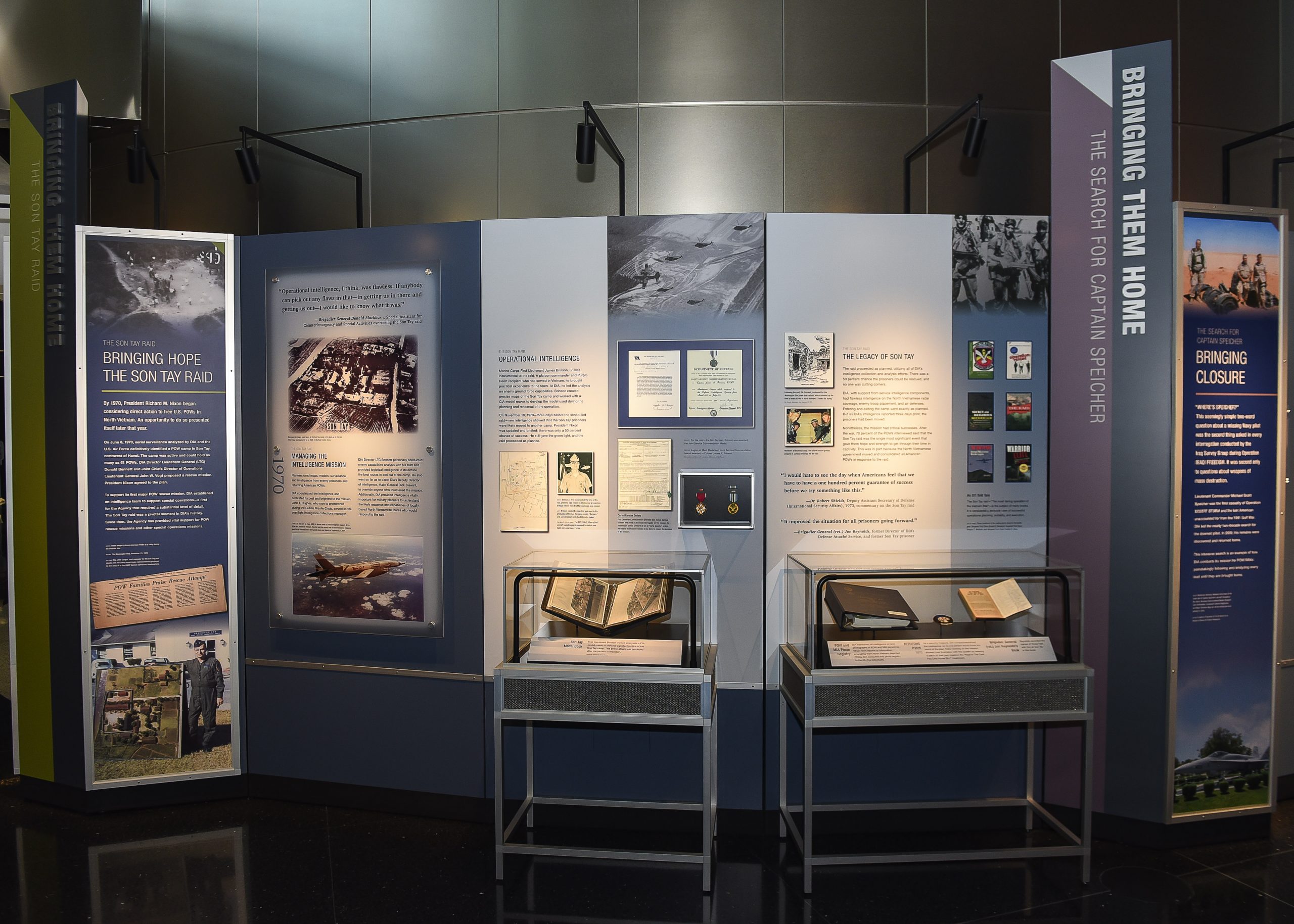
Bringing Them Home
Bringing Them Home delves into DIA’s efforts to bring home prisoners of war, those missing in action, and those killed in action. The risk with stories like these is that they are almost too compelling—stories that are this emotional can run risk of being overly sensationalized.
Here, we needed to balance out the drama of the rescues with the often unseen work done by DIA. The intelligence and coordination needed to conduct a rescue mission is what makes those dramatic “made for the movies” moments possible. REDACTEDREDACTEDREDACTED. Before someone can rescue an injured soldier, intelligence officers need to figure out where they are, how they can get in and out of the building, how they can assess options in real time, and many other things I’m probably not allowed to know about.
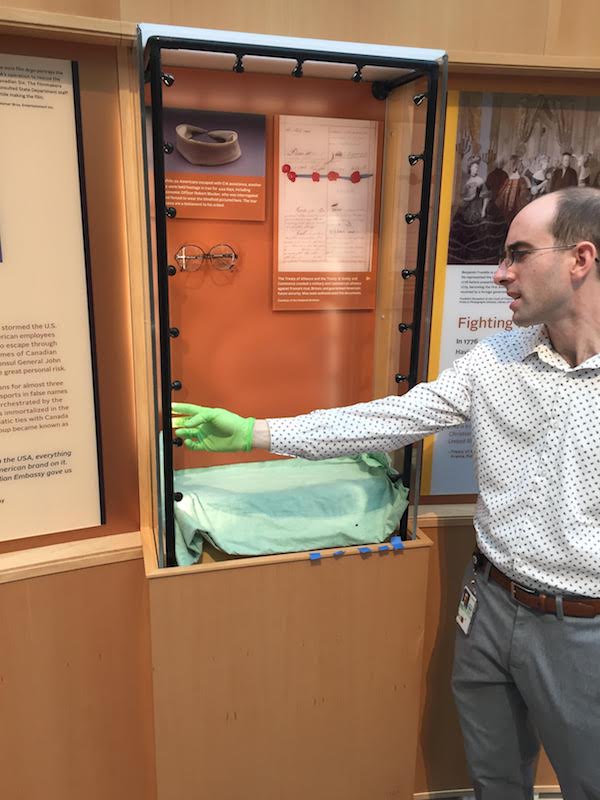
The Bringing Them Home section includes objects, such as the ones shown in cases here, and graphics designed using photographs and primary documents. SIE developed, designed, built, and installed the exhibition.
Staying Ahead
On a lighter note, you should know that we felt the need, the need for speed. Yes, DIA was responsible for Top Gun. You’re welcome, America.
Staying Ahead focuses on the ways DIA uses technology and innovation. For example, the real-life Top Gun program was developed using intelligence DIA gathered by exploiting Soviet aircraft. One of the digital interactives in this section (created by IMG, a partner in this project who handled the audio-visual materials and digital interactives) allows visitors to explore a Soviet MiG aircraft … and another interactive lets visitors take a quiz that asks “what was in Top Gun and what was in real life?” Fun Fact: the DIA exploited MiGs at area 51, where REDACTEDREDACTEDREDACTEDREDACTED. By learning about the strengths and weaknesses of Soviet aircraft, a new flight training program was set up for the U.S. Air Force (known as Red Flag) and the famed program for U.S. Navy (cue Highway to the Danger Zone).
The Staying Ahead section features a silkworm missile, a scud missile, and an aquatic mine that the DIA exploited as part of an intelligence strategy of staying at least one generation of technology ahead of adversaries. FUN FACT: if you are installing full size missiles, you pretty much have to design that entire section around where they physically fit in the building. The reader rail around the scud missile also serves as a barrier. Just because the missile has been deactivated doesn’t mean touching it is a good idea.
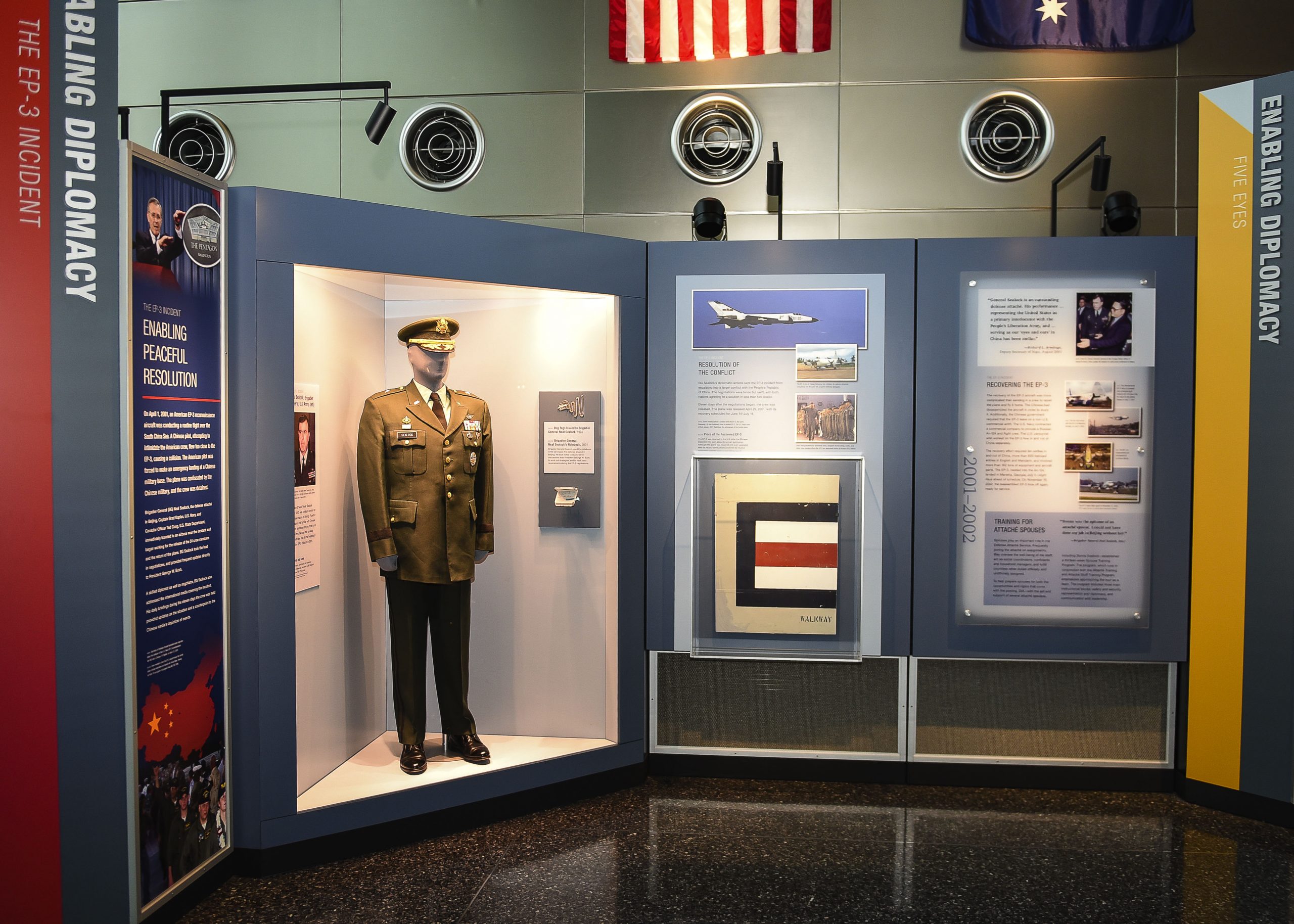
Enabling Diplomacy
SIE built a custom triangular case to display a uniform. The case needed to accommodate additional small items and small panels—no easy task when you also have to make sure all of the items are easily viewed and read by visitors. Custom cases were also embedded into the graphic panels for other objects.
The section Enabling Diplomacy tells an often overlooked part of military history—using diplomacy to prevent conflict. Truly, what better way to protect the war fighter than to keep them out of harm’s way in the first place. I was really hoping for some REDACTEDREDACTED.REDACTEDREDACTEDREDACTED or REDACTED. In this section, we looked at treaties, negotiations, and international—REDACTEDREDACTEDcooperation.
But wait! There’s more! Well… admittedly, that wait is going to take a bit. Phase 4 of Mission: DIA is built and ready to go, but not yet installed. Our install date is classified. (Okay, like everything else, the install date was moved because of the Covid-19 situation, but it sounds so much cooler REDACTEDREDACTEDREDACTED to say it’s classified.)
Have you ever walked past an exhibit graphic that seemed to move? Or maybe the image suddenly shifted? Your eyes weren’t playing tricks on you … the graphic was playing a trick on your eyes.
These types of graphics are known as lenticular prints.
What Are Lenticular Prints?
Today’s lenticulars aren’t the moving image stickers you used to get at the doctor’s office as a kid (or adult—no judgment here). You know the ones: if you swiveled it a bit it looked like She-Ra was raising her sword, or a transformer was … transforming. Well now that same concept makes things that do this:
2D Print, 3D Effect
One of the advantages of lenticulars is that visitors can get a nice pop of 3D or animation without needing any additional equipment. As cool as everyone looks wearing those 3D glasses, it’s a bit of waste to supply those for one panel. Lenticular prints simulate motion and/or dimension using specially fabricated two-dimensional prints.
How do the 2D prints make it look 3D?
It’s called stereoscopy. It’s a visual effect created by providing slightly offset views to both of your eyes at the same time. When your brain mushes (technical term) the two visuals together, you see the combined image with additional depth and volume. In other words, your brain takes Image 1 and Image 2 and turns into a much more awesome optical illusion. To do that, the designer has to interlace the images.
But why doesn’t the interlaced image look, well, terrible? And what’s up with that term “lenticular?”
Lenticular comes from “lens,” meaning something curved that refracts lights. The lens that goes on top of the interlaced graphic is called a lenticular lens. It’s made of a series of curved strips called lenticules. Those curved strips refract the light so that you can only see images from certain angles. So the short answers: it’s called lenticular because it has lenses, and those lenses decode the interlaced image into the “changing” graphic.
Why use them?
Other than they’re really fun? Lenticular prints add impact to displays of static photographs and other images. They can also create a depth of content. By layering images on top of each other, a lenticular can show a before and after, or a variety of images on a theme in a way that shows shifts. Recently, Smithsonian Libraries worked with SIE to create lenticular prints for their exhibition Magnificent Obsessions: Why We Collect. Visitors could see the image of a prized possession, and then it would shift, showing the collector. Visitors can see a visual connection between the two images, and figure out that the stories behind those two images are intertwined.
Creating a Lenticular Print
The process for creating a lenticular print can be broken down into three phases: design, printing, and mounting.
Phase 1: design
First, decide on the type of lenticular print you would like.
There are three main options to choose from:
Flip lenticulars create a smooth transition from one image to another using up to 15 frames (think of a flipbook). This type of lenticular can also be used to display 15 distinct images that change depending on viewing angle.
3D lenticulars are created using specialized 3D photography to simulate dimensionality and depth.
“4D” lenticulars include a combination of flip and 3D imagery.
Then establish the viewing distance.
This is critical. Knowing how far away a visitor will be standing determines how the software translates the images when generating the final print. This also determines the appropriate lens material.
Finally, prepare the file.
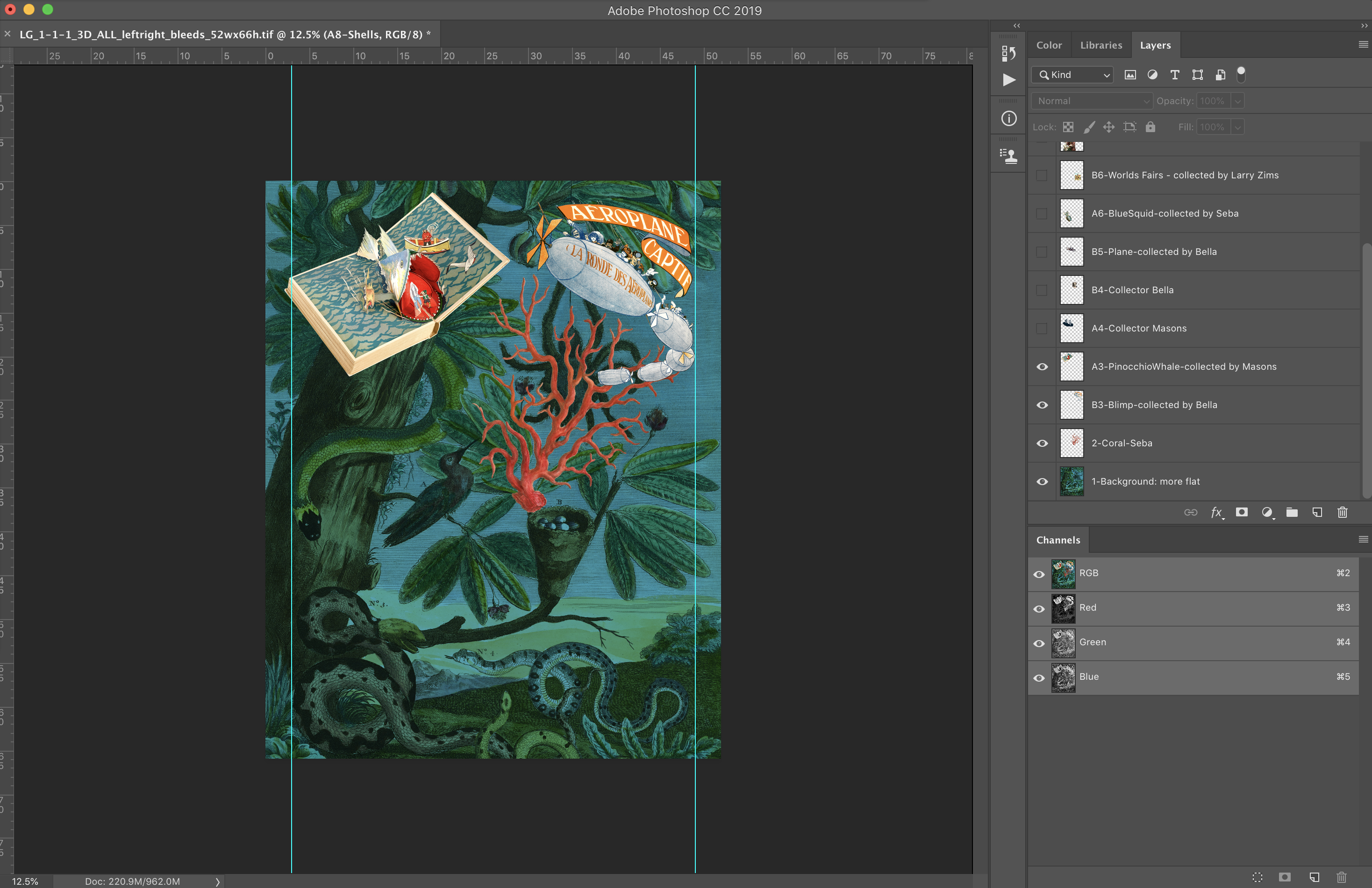
Depending on the lenticular type, the designer compiles a series of images in a layered Photoshop document, building the lenticular from the bottom up. This means the first layer is the background, and all of the other images are layered on top of the background. The images closest to the background look the farthest away.
The screen shots below show how designer Madeline Wan layered the images to create the Magnificent Obsessions lenticular.
The background image does not have a 3D effect.
Next, the book and airship images are layered on top of the background.
An image of three people is added on top of the book and airship layer.
Images of an aquatic creature and a souvenir from the 1893 World’s Fair go on the next layer.
The final layer gets a young boy and a gentleman in a powdered wig.
Then, using specialized graphics software, the designer interlaces the the images.
Phase 2: Printing
The interlaced prints are produced on traditional wide format printers. For the Magnificent Obsessions graphic we used a specialty printing company, Parallax Lenticular Printing, to interlace and produce the final print.
Because the graphic is interlaced, it looks odd at this stage. If, for example, the finished product will be an animation composed of 15 images, the print will resemble 15 separate images that have been run through a paper shredder and then reassembled in the wrong order.
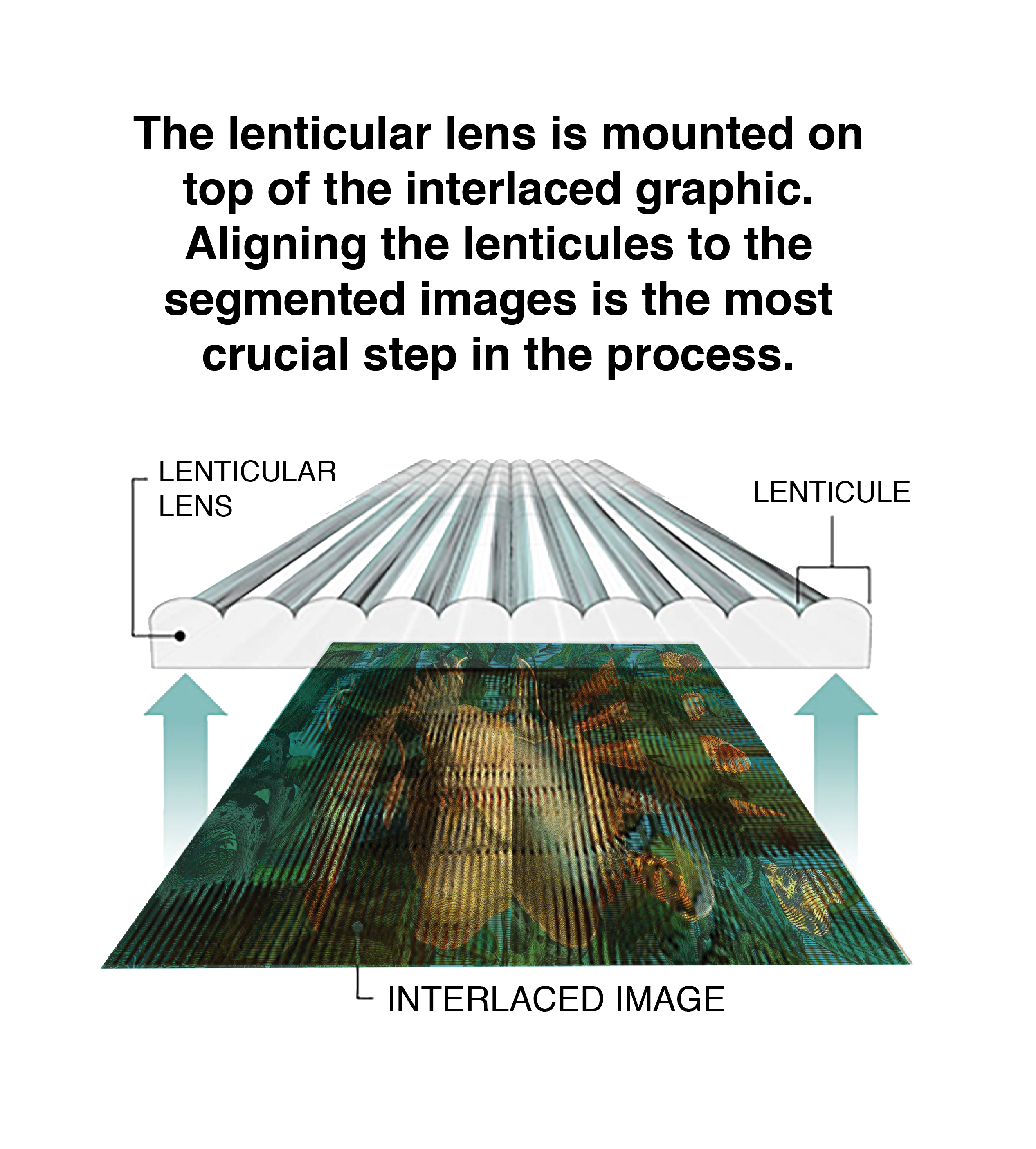
Phase 3: Mounting
The finished print is mounted to a clear plastic sheet with a pattern of lenses designed to pull specific images from the composite image.
Each image strip and lenticule must be aligned perfectly. Their proper alignment is what makes parts of the graphic recede back into the graphic, appear to float off the surface, or shift from one image to another.
The lenticular lens is mounted on top of the interlaced graphic. Aligning the lenticules to the segmented images is the most crucial step in the process.
Alternate Method: Combining printing and mounting
In some instances, the graphic can be printed directly to the reverse side of the lenticular film. This skips the often tedious (and sometimes problematic) step of laminating and mounting the interlaced image onto the lens. Going this route eliminates the risk of things like hair and air bubbles messing up the application of the lens. However, this method typically requires a much more complex printing setup, such as a screenprinter or UV Inkjet.
If you want to see Magnificent Obsessions in person—once the Smithsonian reopens—it’s on view at the National Museum of American History’s Dibner Gallery in 1 West. In the meantime, feel free to check out the Smithsonian’s various online resources.
In September 2019, staff from Smithsonian Exhibits (SIE) and the National Museum of Natural History (NMNH) traveled to Juneau, Alaska, to attend a Tlingit clan ceremony to dedicate a new clan hat—a replica made by SIE. You can watch the entire ceremony on the Sharing Our Knowledge conference website here.
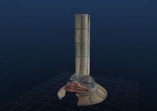
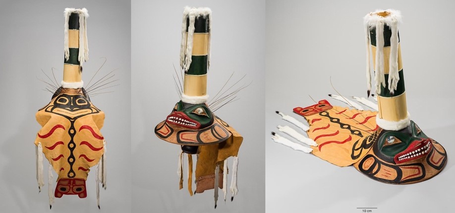
The Tlingit are an indigenous people from southeastern Alaska. In Tlingit society, clans are divided into two distinct groups or moieties: Eagle/Wolf and Raven. The hat SIE worked on belongs to the Raven moiety. It is known as the sculpin hat (or Wéix’ s’áaxw in Tlingit language) for the fish it represents, which is an important crest symbol to the Kiks.ádi clan, to whom the hat belonged. In Tlingit culture, hats such as this one are sacred artifacts, known as At.óow, which are imbued with the spirits of their ancestors and used in dancing and ceremonies.
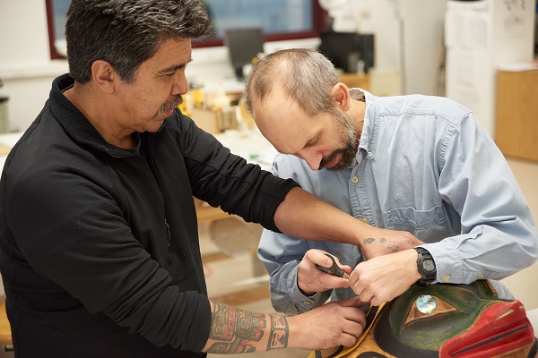
For SIE model maker Chris Hollshwander, the ceremony was more than just the end of another project. It was the culmination of a five-year journey, during which he was adopted into a Tlingit clan and immersed himself in learning about Tlingit culture.
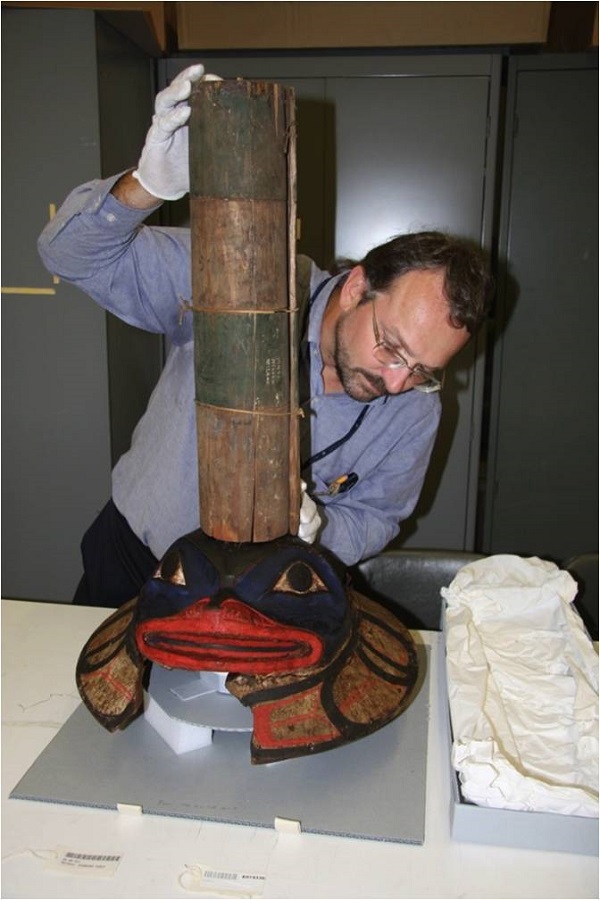
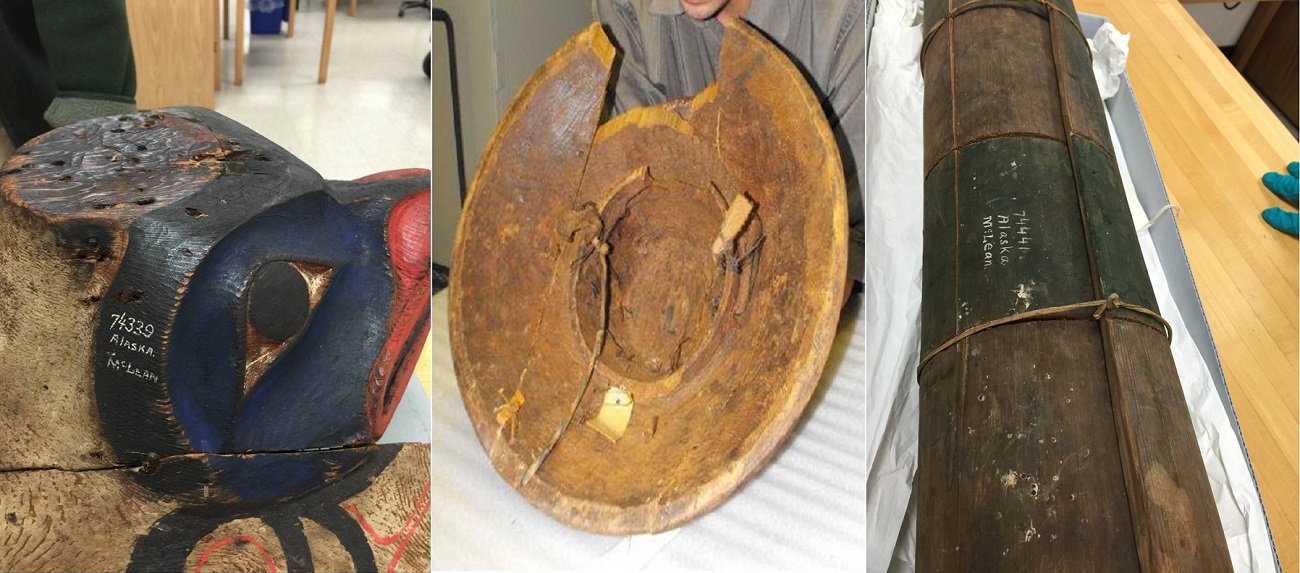
The original sculpin hat was acquired by the Smithsonian in the 1880s and was probably even older. Unfortunately, the hat in the Smithsonian’s collection is broken and lacked important information. In 2012, a visiting Tlingit clan leader, Harold Jacobs, spotted the hat at the Smithsonian’s National Museum of Natural History. He kick-started a seven-year process, which resulted in a replica of the hat being restored to the clan.
Eric Hollinger, Tribal Liaison for NMNH’s Repatriation Office, holds the original sculpin hat. Image courtesy of NMNH.
Details of the original sculpin hat in the Smithsonian’s collection, showing the hat and the broken potlatch cylinder. Images courtesy of NMNH.
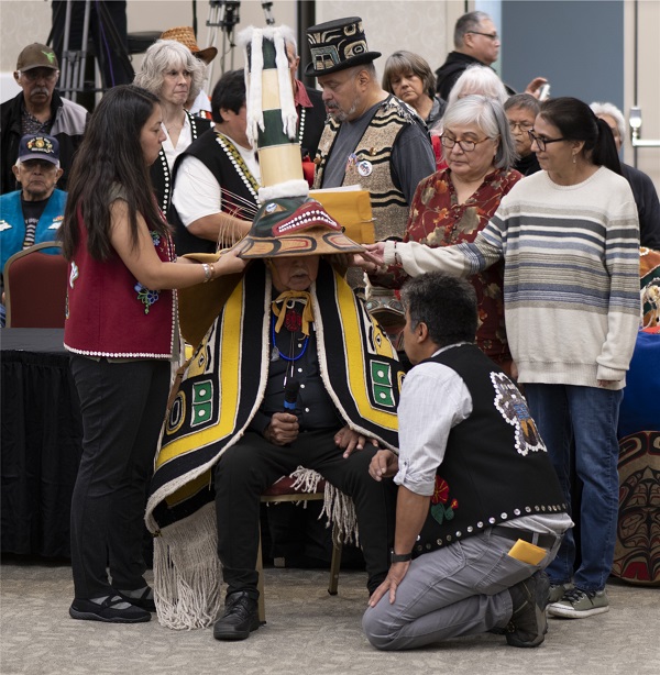
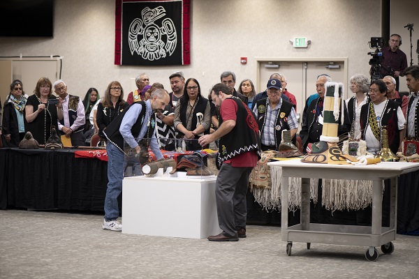
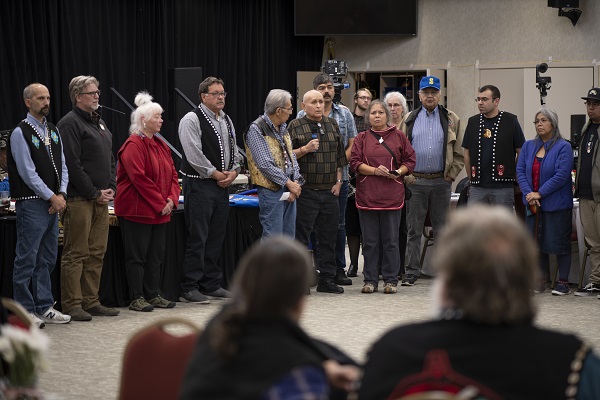
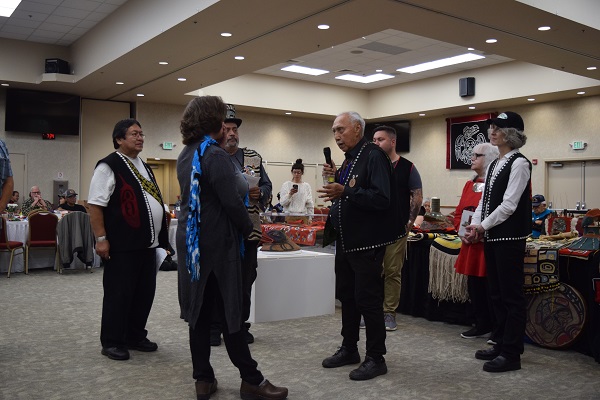
Staff from NMNH brought the original hat to the ceremony in September to accompany the reproduction. During the ceremony, clan members instilled a spirit into the new hat so that it could be danced again, more than 130 years after the original hat left. Chris, SIE director Susan Ades, and SIE model maker Carolyn Thome all attended the ceremony. During the celebration, Carolyn was formally recognized for her contributions and adopted into the Kiks.ádi clan. You can read an article about the ceremony here.
Kiks.ádi clan leader Ray Wilson wears the new sculpin hat made by SIE.
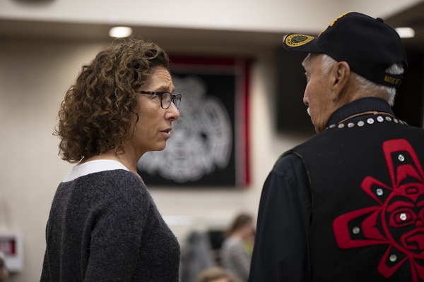
SIE Director Susan Ades speaks with Kiks.ádi clan leader Ray Wilson before the ceremony.
Chris Hollshwander (SIE) and Eric Hollinger (NMNH) place the original hat on display at the start of the ceremony.
Deisheetaan clan leader Cyril Zuboff and other Raven moiety clan leaders provided remarks during the ceremony.
Chris (pictured at the left) and members of the Kaagwaantaan clan (Eagle/Wolf moiety) acknowledge remarks by members of the Raven moiety during the ceremony.
SIE model maker Carolyn Thome (center) being adopted into the Kiks.ádi clan.
The ceremony was a fitting end to a long process, but how did SIE get involved in the first place?
Chris was introduced to the project in 2014, when clan leaders visiting NMNH interviewed him to get to know him better and gauge his level of interest in working on the hat. The goal was to create two replicas: one would be restored to the clan and used in ceremonies; the other would remain at NMNH, where it would be used for educational purposes. To the clan, it was important that whoever made the new hat for them should be a member of the Eagle/Wolf moiety. In order to work on the hat, Chris was adopted into the Kaagwaantaan (Wolf) clan, at a ceremony at NMNH a few days later by Kaagwaantaan clan leader Andrew Gamble.
Chris (center) with Tlingit clan leaders and Smithsonian staff at a ceremony at the National Museum of Natural History in 2014. Image courtesy of NMNH.
You can read more about the background to this project in a blog post by Eric Hollinger, Tribal Liaison for NMNH’s Repatriation Office, who was involved in the project from the beginning and was instrumental in its success.
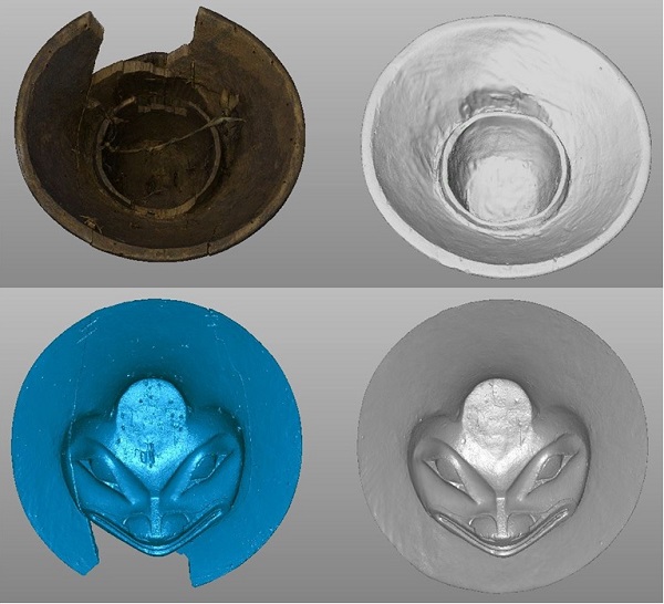
To prepare for the replicas to be made, NMNH took a CT scan of the original hat and partnered with the Smithsonian’s Digitization Program Office (DPO) to create a digital model by 3D scanning the hat with structured light scanners. They also took a series of photos, in a process known as photogrammetry, which would be processed into a digital model. You can take a virtual tour of the 3D model here.
Carolyn processed the original 3D scan files for online viewing. Image of the final model courtesy of DPO.
Since the original hat was broken into multiple sections and had become warped over time, the first step was to repair it digitally. Using the files from DPO, Carolyn painstakingly repaired the hat through a process known as digital sculpting. She joined the cracks, bridged the gaps between the sections, and erased any non-original parts to prepare the 3D model for milling.
Carolyn made digital repairs to the 3D model of the hat to prepare it for milling.
Meanwhile, the wood for the replicas needed to be sourced. The original hat was made of cedar. Since the clan intended to use their restored hat for dances, they decided to use alder, a stronger wood. The replica for the museum was to be made with yellow cedar. Both types of wood were harvested and shipped from Alaska, then had to be kept in freezers to avoid drying and cracking before the production of the replicas began.
NMNH staff at the Smithsonian Museum Support Center in Suitland, Maryland, roll the alder logs into the freezer for storage.
To test the files and the machine settings, Chris milled a half-scale prototype of the hat, which he brought with him to Sitka, Alaska, in October 2017 to attend the Sharing Our Knowledge Conference.
Chris shows clan leader Ray Wilson the half-scale replica of the hat. Image courtesy of NMNH.
The conference was a great opportunity for Chris to meet with clan members and learn more about their culture and traditions, while also demonstrating the Smithsonian’s 3D digitization and replication technology. You can read more about the conference here.
Eric Hollinger (left) and Chris prepare another hat—the Coho Clan hat—for digitization at the Sharing Our Knowledge Conference. Image: Nick Partridge, Smithsonian.
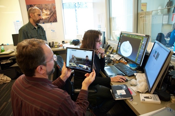
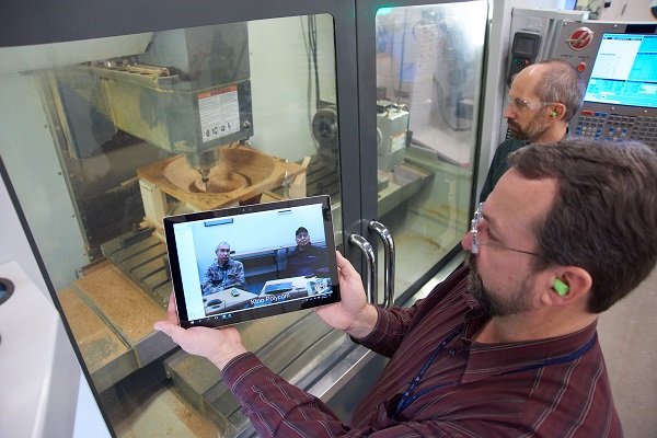
Once the clan approved the prototype, Chris got to work making the full-size replicas. Because the work was done at SIE’s facility in Landover, Maryland (nearly 3,000 miles away from Alaska), the Smithsonian used videoconferencing to allow clan representatives to watch the progress that was being made. Another example of modern technology at work!
While clan leaders watch from Alaska, Carolyn explains the digital sculpting process to repair the files in preparation for CNC milling.
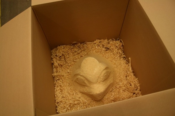
One of the most challenging parts of the process was working with the wood and the number of machining set ups that were required. Because the wood was fresh, Chris needed to mill the pieces gradually over time, allowing the wood to slowly adjust in the freezer to avoid warping, cracking, and drying out too fast. The process involved roughing the hats out, then drying them slowly in a bed of their own wood chips outside of the freezer. When the wood was dried, Chris was able to do the final milling.
The wood had to be kept in a freezer between milling steps.
The hat replica drying in wood chips prior to final machining.
Eric and Chris videoconference with clan representatives in Juneau, Alaska, to show the work in progress.
Chris mills the replica using the CNC (computer numerical control) milling machine at SIE. Image courtesy of NMNH.
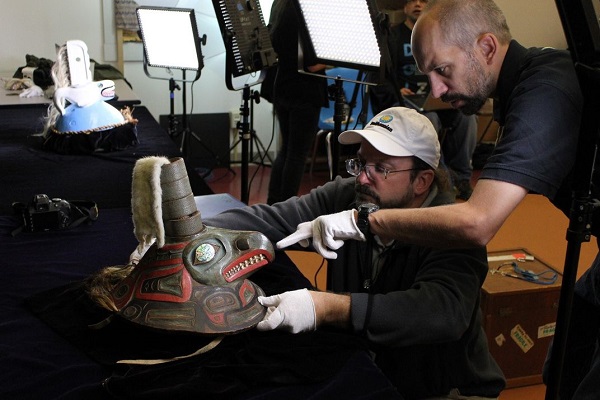
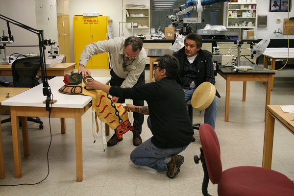
The final step was finishing the replicas under the supervision of Tlingit clan leader and artist Cyril Zuboff. Zuboff advised Chris and Eric on how to paint and attach materials to the hats, including shells, deer hide, sinew, ermine skins, and sea lion whiskers.
Eric and Cyril review the deer skin design and attachment while Deisheetaan clan leader Garfield George provides Tlingit songs.
Cyril helps Chris attach the deer skin cape to the new hat for the Kiks.ádi clan. Image courtesy of NMNH.
The Smithsonian Women’s Committee (SWC) generously funded the creation of the replicas through a grant. Members of the SWC came to meet with the project team and observe the finishing process.
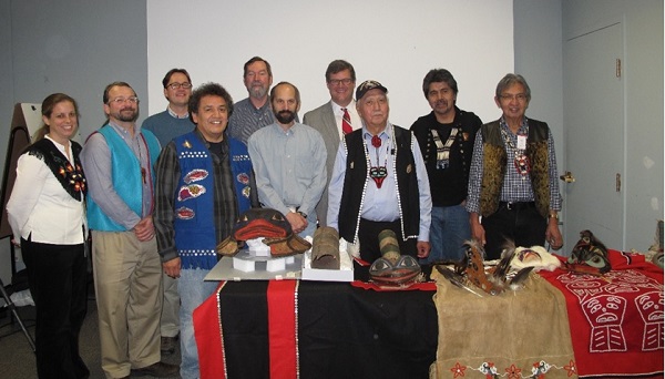
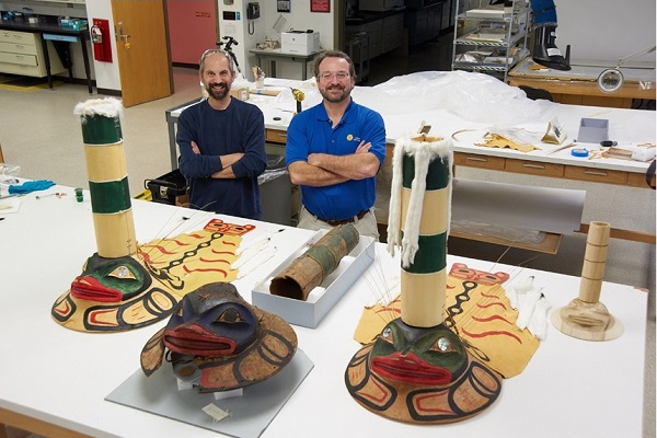
Chris and Eric pose with the nearly completed hats along with Deisheetaan clan leaders Garfield George (left) and Cyril Zuboff (center) and members of the Smithsonian Women’s Committee.
You can watch a slideshow of the entire process here.
Chris and Eric pose with the original hat and the nearly completed replicas. Image courtesy of NMNH.
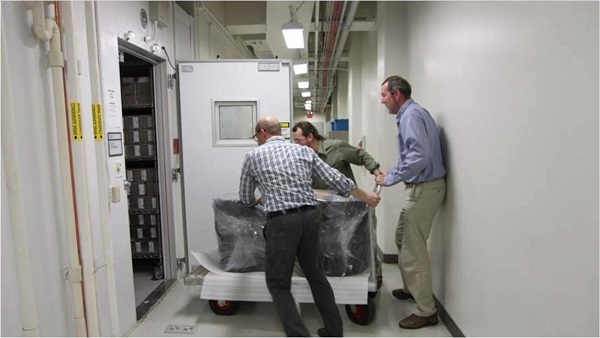
After the replicas were completed, they remained at NMNH with the original hat. As preparations for the trip to the ceremony started over the summer, SIE provided a custom-fitted travel case for the alder hat. This will enable the hat to be transported to ceremonies in the future. SIE also fabricated a custom box for the original hat, to be couriered by NMNH Repatriation Office staff to Juneau.
When the hats were presented at the ceremony, clan members were thrilled with the results and were overjoyed to welcome home a part of their culture that had been away for more than 130 years. The new alder hat will eventually be brought to Sitka, Alaska, returning it to where it belongs for future generations. This project marks the first time that a traditional cultural object has been digitally restored and replicated and then dedicated as a sacred object by an indigenous community.
The completed replica restored to the clan. Images courtesy of NMNH.
For Chris and Carolyn, adopted clan members, this has been more than just another project. It has been an experience that will stay with them for the rest of their lives.
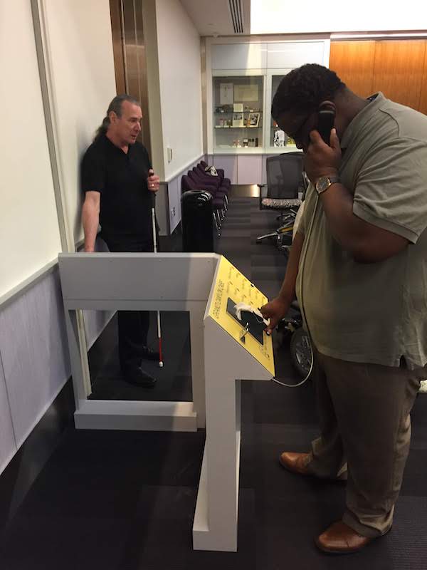
Exhibits are for everyone, and Smithsonian Exhibits (SIE) strives to make our exhibits as accessible as possible. Last year, thanks to a grant from the Smithsonian’s Accessibility Innovation Fund, we were able to experiment with strategies for making exhibits more accessible to people who are blind and have low vision.
A typical museum display case containing artifacts, text, and images.
Think about a typical exhibit and you might picture a glass display case with artifacts, text, and images inside. Now consider this from the perspective of a person who is blind or has low vision. How can you engage with the artifacts, text, and images inside if you can’t see them? It’s frustrating, right? SIE decided to take on this challenge and find solutions to make exhibit cases and graphics more accessible.
Throughout the process, SIE worked closely with Access Smithsonian, the Smithsonian’s central office devoted to visitor accessibility, which funded the project and provided guidance and expertise along the way. Access Smithsonian connected us with their network of User Experts, volunteers with disabilities who help the Smithsonian test exhibits and advise us on how to make them more accessible. This was crucial, because—as with any exhibit—understanding your audience and their needs is key to success.
At the project’s kick-off meeting, we sat down with a group of User Experts with varying levels of vision to listen to their needs and common barriers that prevent them from engaging with exhibits. Among other things, the User Experts stressed the importance of providing the exhibit’s big picture up front and incorporating a range of different tools, including tactile elements, audio components, and braille.
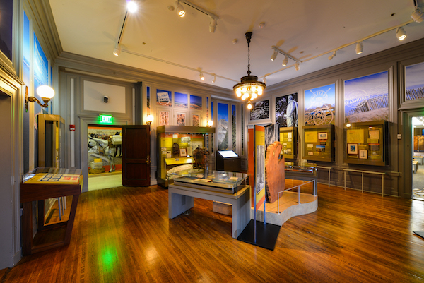
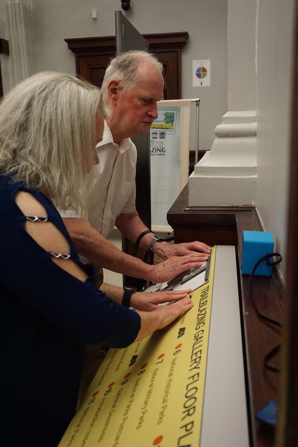
The next step was to select an exhibit to work with. SIE wanted to use an exhibit that was already open to the public. Consulting with curators at the National Postal Museum, we selected Trailblazing: 100 Years of Our National Parks, an exhibit SIE was already familiar with from having worked on the graphics.
Trailblazing: 100 Years of Our National Parks at the National Postal Museum
During the research and planning phase of the project, we spoke with accessibility experts and visited other museums to learn more about existing accessibility solutions.
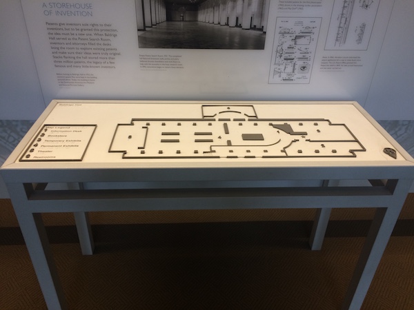
A tactile floor plan at the National Park Service’s White House Visitor Center
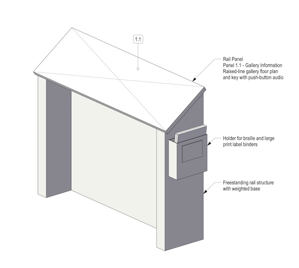
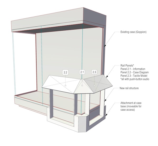
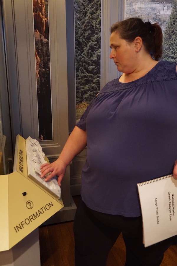
We decided to create two reader rails for Trailblazing: one to provide an introduction and overview of the exhibit and another to interpret a display case on mail delivery in the Grand Canyon, which included a mix of artifacts, text, and images.
Initial design for the intro/overview reader rail structure
Initial design for the display case reader rail structure
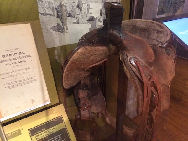
One of the star artifacts of the exhibit was a mule mail riding saddle used to deliver mail to the bottom of the Grand Canyon, the only place in the U.S. where mail is still delivered by mule.
The exhibit included a saddle used to deliver mail to the bottom of the Grand Canyon by mule.
During the design phase, SIE solicited feedback from accessibility experts along the way, which helped us rethink some of our initial plans and refine our designs.
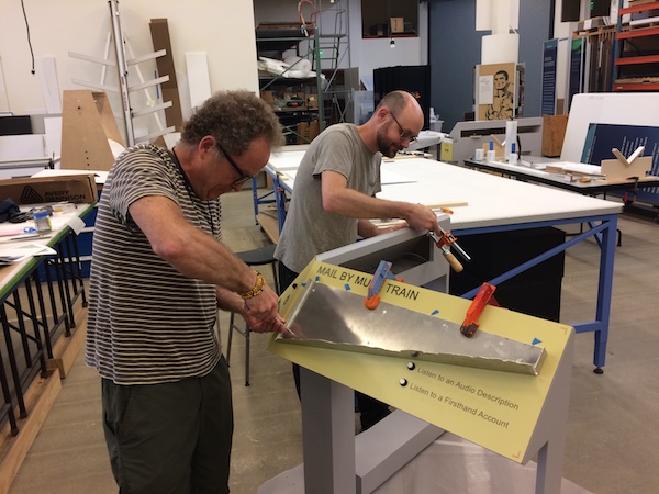
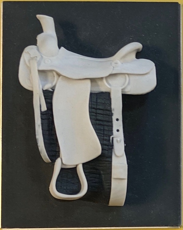
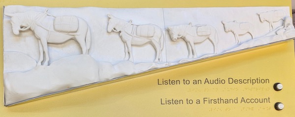
SIE built physical prototypes of the two reader rails. These included braille, raised characters, a raised-line floor plan of the exhibit, buttons playing audio descriptions, and 3D tactile models of a mule mail riding saddle and a mule mail train.
SIE’s graphics team assembles the reader rails.
SIE’s 3D studio created a tactile model of the mule mail riding saddle from the display case.
The prototype also featured a tactile model of a mule mail train delivering mail to the Grand Canyon.
Then, it was time to test!
We installed the prototypes in the Trailblazing gallery and invited User Experts with varying levels of vision to come try them out.
Testing round one: User Experts test the prototypes at the National Postal Museum. Image courtesy of Access Smithsonian.
Testing round one: User Experts test the prototypes at the National Postal Museum. Image courtesy of Access Smithsonian.
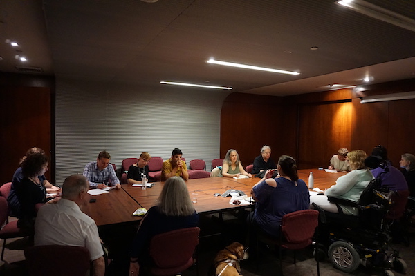
User Experts and Smithsonian staff sit down to discuss the experience.
Afterward, we sat down with the User Experts to listen to their feedback. People loved the tactile models. But the audio descriptions played through speakers were muffled and hard to hear. This was a problem, especially for the typical scenario of a crowded gallery. Based on the group’s feedback, we decided to replace the speakers with audio handsets as well as a separate audio jacks, to allow visitors to plug in their own headphones.
The group had several other helpful recommendations, including shortening some of the audio descriptions, adjusting the location of the tactile floor plan to make it more intuitive, and aligning the braille text with the buttons.
Based on this feedback, SIE brought the prototypes back to the shop and redesigned them. After all the modifications were made, it was time for round two!
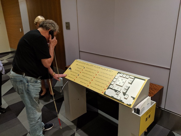
Testing round two: User Experts test the refined prototypes.
Testing round two: User Experts test the refined prototypes. Accessibility expert Ray Bloomer from the National Park Service (left) provided help and guidance throughout the project.
Round two of the testing confirmed that we were on the right track and opened up more possibilities for future exploration. The User Experts expressed an interest in being able to pause, rewind, and fast forward the audio, and recommended that audio components be placed in a consistent location on all panels to make them easier to find.
Some User Experts were concerned about “feeling in the way” when using the audio handsets and suggested adding a portable handheld device or enabling visitors to play the audio on their own devices.
SIE learned an incredible amount from the Trailblazing project, which we have already begun to implement in our latest exhibits. Working with visitors who are blind and have low vision gave us a deeper understanding of the needs of this important audience. The project reaffirmed SIE’s commitment to providing high-quality 3D tactile experiences and provided new insights into working with braille, raised characters, and audio descriptions.
This May, SIE will be sharing our findings as part of a panel on accessibility at the Smithsonian at the American Alliance of Museums’ Annual Meeting in San Francisco. In the meantime, we’re working on several other accessibility initiatives. (More on those soon!)
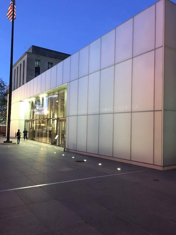
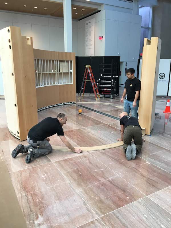
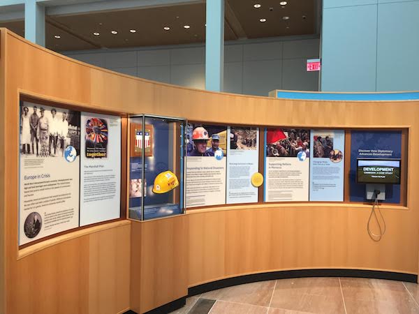
Washington has museums devoted to many subjects. But until recently, it didn’t have one devoted to diplomacy. That changed in November, when the U.S. Department of State unveiled the National Museum of American Diplomacy (NMAD) with its inaugural exhibition, Diplomacy Is Our Mission.
Smithsonian Exhibits (SIE) was thrilled to be part of the project. We provided exhibit development, design, graphic production, fabrication, 3D studio, and installation services for the exhibition as well as a separate gallery devoted to the Signature Segment of the Berlin Wall.
As NMAD prepares for its future permanent exhibitions (read more about that here), Diplomacy Is Our Mission allows the museum to highlight its amazing stories and collections. Find out how you can visit the exhibition here.
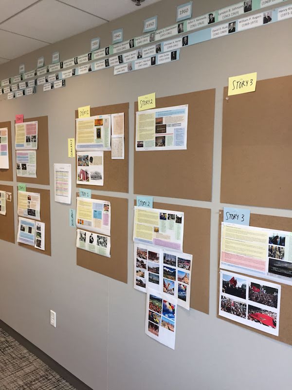
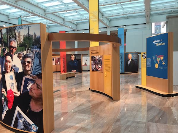
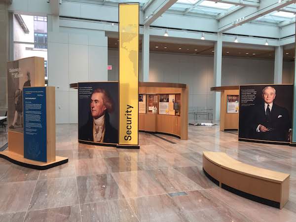
The project started with a content development phase, during which SIE worked with NMAD’s team to identify their main themes and select stories, artifacts, and images to support them. The team settled on four central themes to help tell the story of diplomacy: Security, Prosperity, Democracy, and Development.
Selecting which stories, artifacts, and images to include was no easy task. The museum spans the entire history of U.S. diplomacy from 1776 to today and covers events that occurred all over the world. NMAD’s collection features more than 9,000 items. That’s a lot of artifacts to pick from!
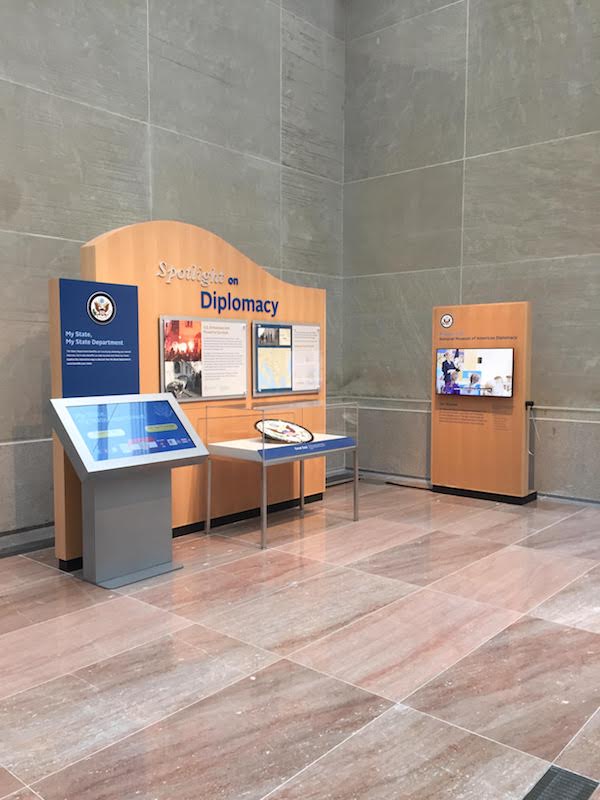
To help narrow the focus, the team decided to select three stories to support each theme: one historic, one contemporary, and one surprising or unusual. NMAD plans to refresh these stories periodically during the span of the exhibition to add new content and encourage visitors to come back. The team also decided to include an updatable section in the exhibition, called “Spotlight on Diplomacy,” which allows NMAD to address current events and mark anniversaries of historic milestones.
Behind the scenes of the story selection process: NMAD’s team displayed story ideas on the walls of their offices.
The exhibition is located in the National Museum of American Diplomacy’s pavilion, an addition to the State Department’s historic entrance.
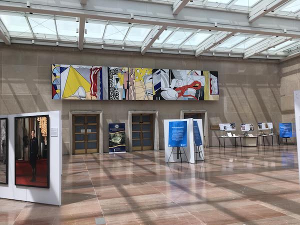
NMAD used the pavilion to host other temporary exhibitions prior to Diplomacy Is Our Mission. A replica of Roy Lichtenstein’s Greene Street Mural, hanging in the space, provided SIE’s design team with color inspiration. Through the nonprofit organization Foundation for Art Preservation in Embassies (FAPE), a larger replica of this mural will be installed in the U.S. embassy in Mexico City.
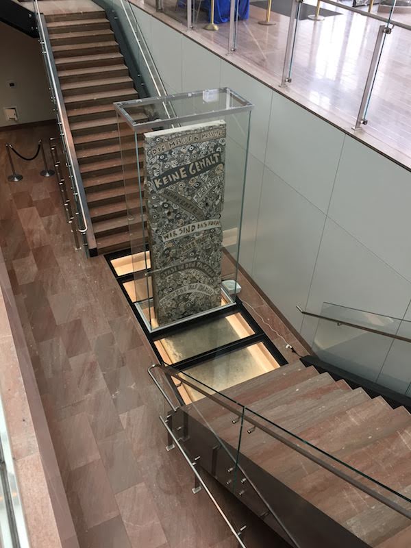
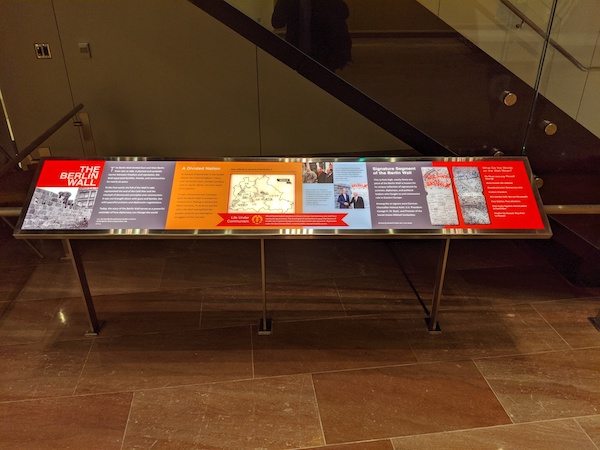
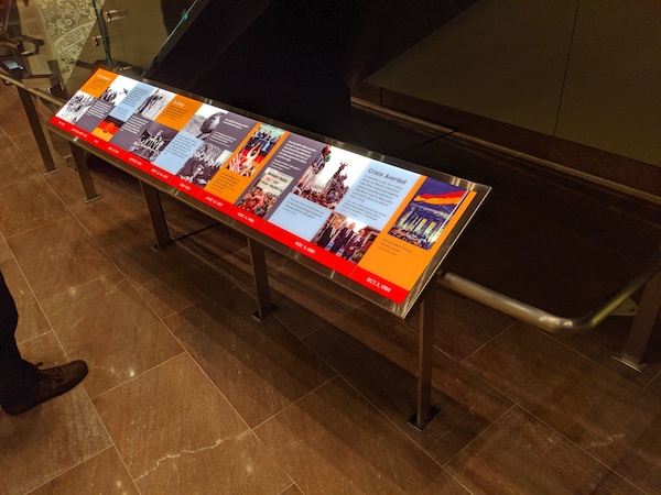
The Signature Segment of the Berlin Wall, on the pavilion’s lower level, features the signatures of 27 leaders who played a significant role in advancing German reunification. SIE worked with NMAD to design reader rails flanking the stairs to provide interpretation for this iconic artifact.
NMAD wanted a design that would stand out while complementing the existing architecture of the pavilion and the historic entrance to the State Department. NMAD also wanted to create a more intimate gallery experience within the pavilion, a large open space dominated by Tennessee pink marble, metal, and glass.
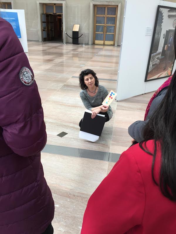
SIE Exhibit Designer Emily Sloat Shaw shows the team the proposed color swatches for the exhibition.
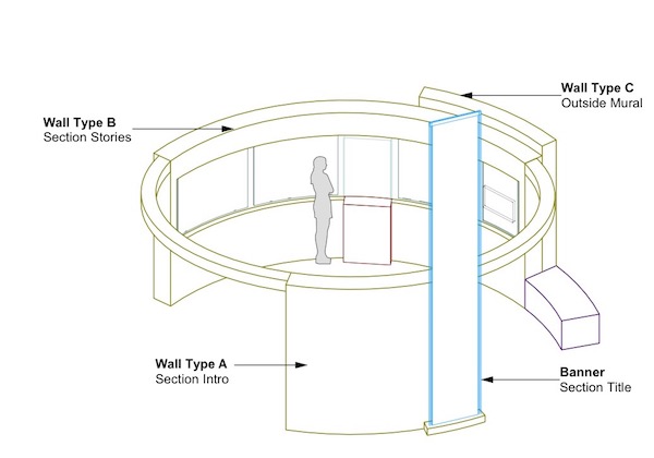
SIE’s design team came up with a system of four self-contained circular modules, one for each theme, which would allow visitors to wander in and out of distinct gallery spaces without restricting visitor flow. Large banners would identify the theme of each module.
A drawing showing the design of the exhibition modules
The exhibition featured some unusual artifacts from NMAD’s collection. Here, NMAD Collections Manager Eric Duyck (right) prepares artifacts for mount making, including a cococho, a tool used to uproot illegal coca plants.
NMAD also had some artifacts that were too fragile to display and needed to be replicated. Here, SIE Model Maker Carolyn Thome creates a 3D-printed model of a statuette from the State Department’s Diplomatic Reception Rooms.
Carolyn shows NMAD staff two small-scale 3D models of a statuette from the State Department’s Diplomatic Reception Rooms depicting Benjamin Franklin and King Louis XVI.
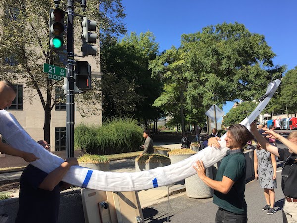
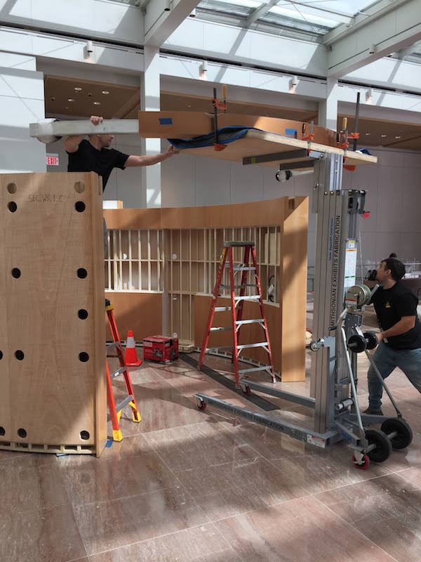
SIE assembles the exhibition modules at SIE’s facility in Landover, MD.
SIE’s fabrication team assembles an exhibition module.
The printed exhibition graphics ready for mounting.
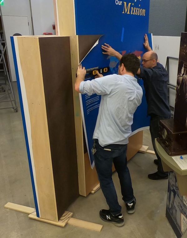
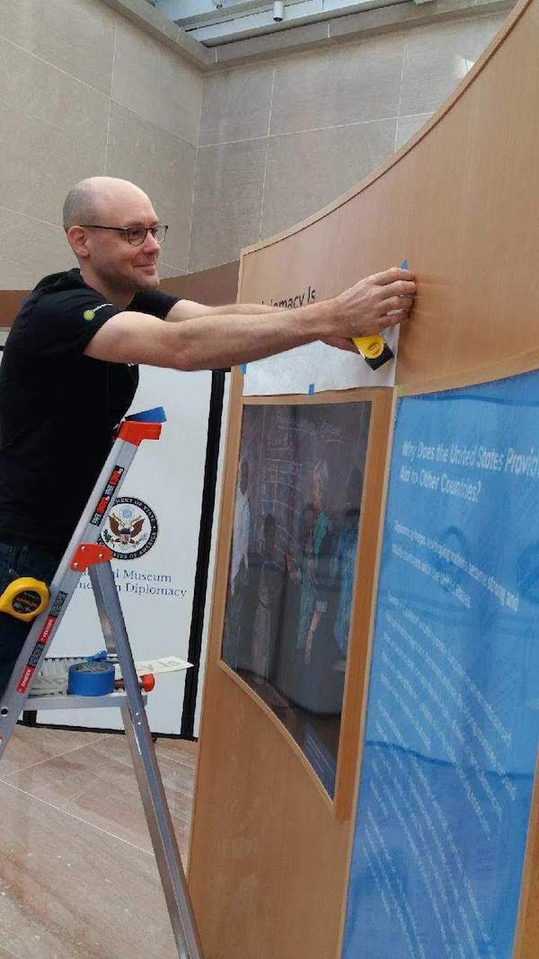
SIE’s graphics team applies a graphic to the intro section of the exhibition.
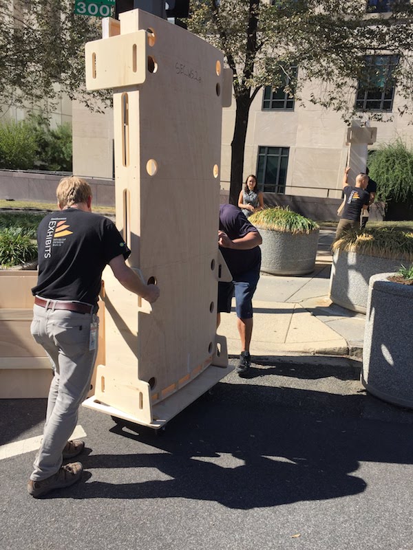
SIE’s fabrication team delivers exhibition components to NMAD for installation.
The unwieldy exhibition section headers needed careful handling.
SIE’s fabrication team installs an exhibition module at NMAD. Precise measurements were needed to line everything up correctly.
SIE’s fabrication team installs a section header.
SIE Exhibits Specialist Caleb Menzies installs the exhibition graphics.
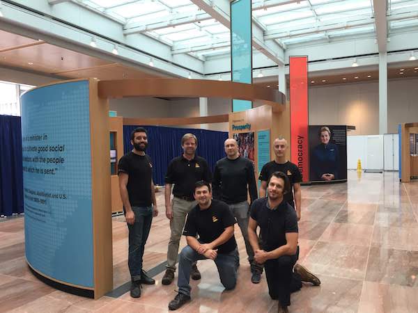
Job well done. SIE’s fabrication team poses in front of the completed exhibition.
NMAD Collections Manager Eric Duyck installs artifacts in a display case.
SIE’s lighting contractor puts the finishing touches on the lights. Large portraits of former Secretaries of State grace the exteriors of each module.
The finished exhibition, ready for visitors. A colorful map in the intro section (at the right) shows the worldwide presence of the State Department.
Bold banners identify each themed module.
Each module includes artifacts and a short video highlighting the theme, produced by NMAD and Smithsonian Digital Studio.
The Spotlight on Diplomacy section features a touch-screen interactive, produced by NMAD and Smithsonian Digital Studio, which allows visitors to explore how diplomacy benefits their state.
SIE created two backlit reader rails for the Berlin Wall exhibit, exploring the history of the Berlin Wall and diplomacy. The reader rails attach seamlessly to the existing handrail below the stairs.
With the launch of The Berlin Wall exhibit, NMAD debuted the Museum of American Diplomacy Eye (MADI), a mobile guide developed in partnership with the Smithsonian’s Hirshhorn Museum and Sculpture Garden, which allows visitors to scan images and artifacts with their smartphones to access historic footage.
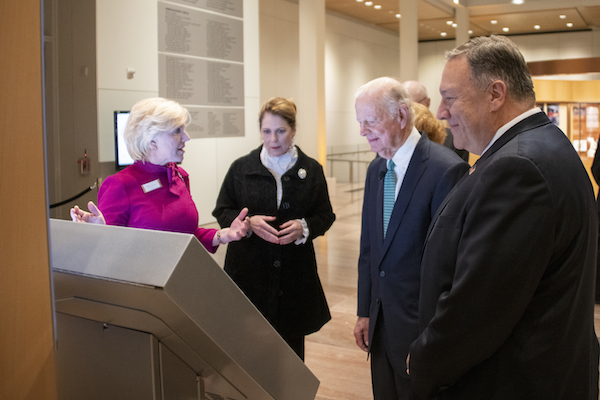
NMAD Director Mary Kane (left) shows the exhibition to U.S. Secretary of State Mike Pompeo (right), his wife Susan (center left), and former Secretary of State James A. Baker, III (center right). Image courtesy of the U.S. Department of State.
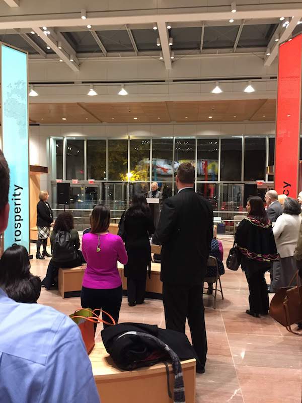
NMAD hosted several public events to celebrate the opening of the exhibition.
The project involved all of SIE’s departments and showcased our full capabilities to develop, design, and build first-class exhibitions. SIE was delighted to be involved in the project and looks forward to future collaborations with NMAD and our other federal partners.
In September, SIE’s exhibit developers Brigid Laurie and John Powell flew to Argentina for a weeklong exhibit development workshop, leaving everyone in the office to fend off rogue commas, dangling participles, and incomplete narratives all by themselves. The horror!
Why did we get to do this?
Back in May, Smithsonian Exhibits (SIE) had the pleasure of hosting a group of Argentinian museum professionals. Our guests were participating in a yearlong cooperative program, Capacity Building for Argentinian Museum and Cultural Heritage Professionals. The program was organized by the Smithsonian, the U.S. Embassy in Argentina, and Argentina’s Dirección Nacional de Museos (DNM). We had a wonderful conversation, exchanged information, and said, “let’s keep this discussion going!”
And the conversation did continue! A few weeks after that first meeting, the Smithsonian’s Office of International Relations and Global Programs (OIR) contacted SIE about offering an exhibit development workshop in Buenos Aires. We (Brigid and John) jumped at the opportunity.
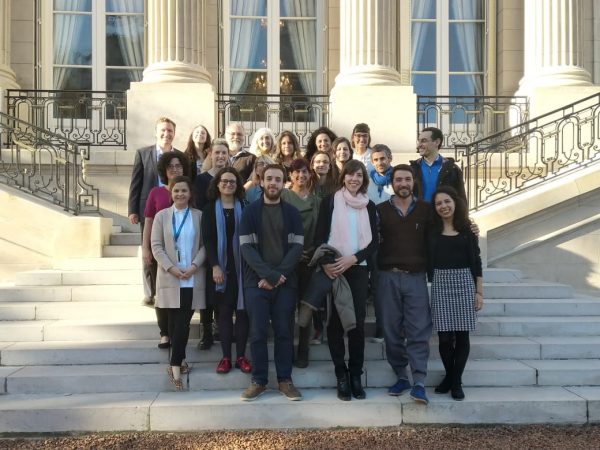
Workshop participants pose on the stairs of the U.S. Ambassador’s residence in Buenos Aires.
With a Little Help from Our Friends
Working with OIR, we came up with a full schedule of presentations and activities. In Argentina, we were joined by Magdalena Mieri from the National Museum of American History and Sara De La Torre Berón from OIR, who have been part of the program since it started. Magdalena, one of the program’s mentors, led a session on strategic planning. Sara coordinated the workshop on behalf of OIR and made everything go incredibly smoothly.
Who attended?
Twenty participants attended the workshop from five different museums across Argentina. As you would expect, the museums were all at different points in their projects. Some are opening in the near future; others had just started up when this program began. Additional museum professionals from Buenos Aires also attended when their schedules allowed.
What did we talk about?
The program focused on audience-centered exhibit and program development. With that in mind, we organized each day of the workshop around a larger topic. Each day built on the previous day’s topics.
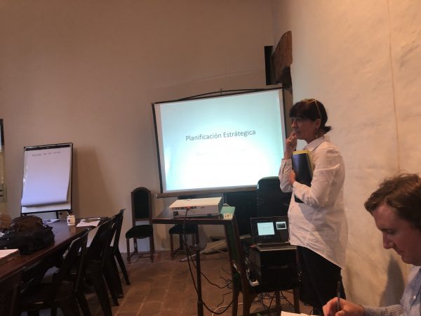
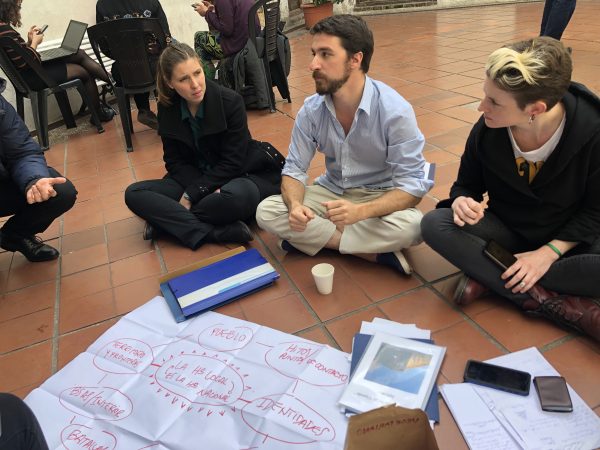
Day one focused on understanding visitor needs and strategic planning.
Participants worked in small groups, discussing long-term goals for their museums and possible ways to implement them.
Magdalena Mieri leads a session on strategic planning.
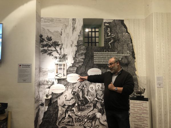
We also had an opportunity to visit the nearby Museo Cabildo, where they showed us the prototyping they are doing for an upcoming exhibit.
Gustavo Alvarez, director of the Museo Cabildo, explains their prototyping process for a new exhibition.
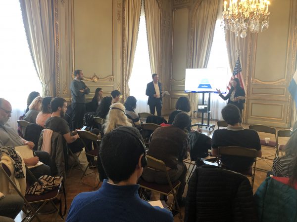
On day two, we met at the residence of the U.S. Ambassador to Argentina, a historic mansion, where we discussed interpretive hierarchies beneath exquisite chandeliers.
Why are people wearing headphones? The U.S. embassy provided simultaneous Spanish-English interpretation via headsets. This let everyone participate in the language with which they were most comfortable.
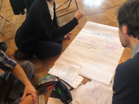
Workshop participants chart their big idea and key messages for a new exhibition. Sometimes, even in the fanciest of spaces, the best thing to do is to sprawl out on the floor.
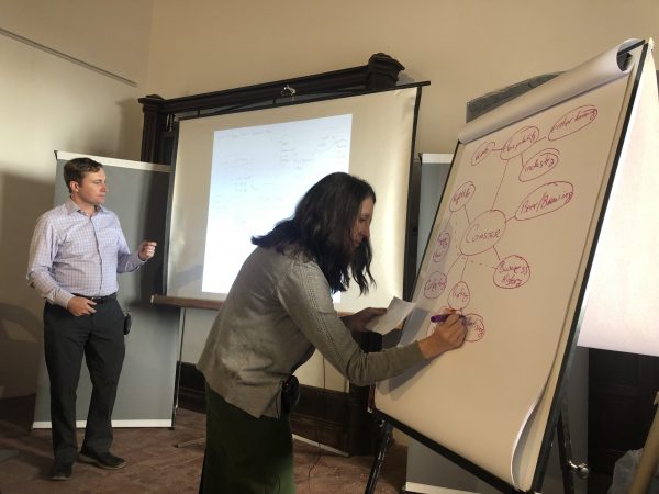
By day three, we were ready to dive into the specifics, and talked about ways to organize exhibit content and how to select different tools and techniques to tell a story. We started day three with a random object exercise to consider all the stories you can tell with one seemingly insignificant object, like a coaster.
Content mapping is a visual way to organize topics. (NOTE: While awkward posture and bad handwriting aren’t a requirement for exhibit developing, they do add a certain flair to presentations.)
Dina Fisman from the DNM led a session on exhibit writing, focusing on how to write for an Argentinian audience. We got to listen to her session (thanks, interpreters!)—it was wonderful and insightful.
Dina Fisman leads a session on exhibit writing.
Day four was the last formal day of the workshop. We covered how to take exhibits from concept to completion. We shared some sample documents from our work at SIE and met with participants to discuss a variety of exhibit-related topics.
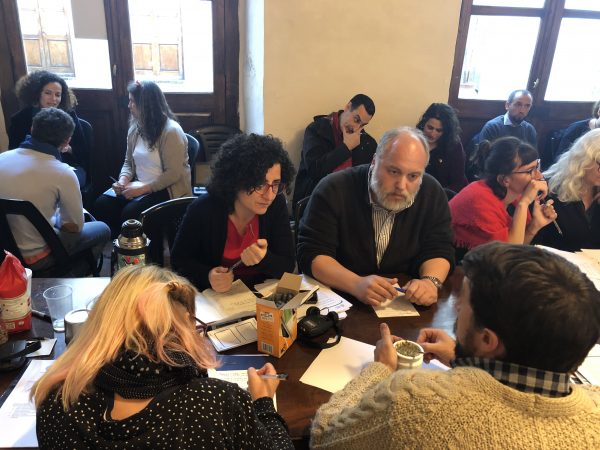
A group discusses ways to combine two topics within an exhibit.
We capped the day with a public presentation at the Museo Roca. It felt like a fitting end to the workshop and it was great to be able to share our experiences with the larger museum community in Buenos Aires.
Thanks to our simultaneous interpreters we were able to field questions at the end of our presentation.
We spent our last day visiting two different museums in Buenos Aires and learning about their efforts to create visible storage for collections and make museums more accessible.
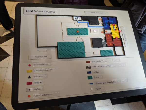
The orientation map at Museo Casa Yrurtia incorporates braille and a variety of different textures. The map is intended to be used by all visitors.
We look forward to keeping in touch with our colleagues in Argentina and hearing about their exhibits. It was a wonderful learning experience for us and we can’t wait for our next opportunity to take our show on the road!
It seems like AR and VR have been hot topics for a while, and for good reason. Oldsters like me tend to point to the young whippersnappers who grew up as digital natives and assume that they want a screen in every exhibition. The thing is, with a good interpretive plan and a digital/media team (in-house or an outside partner) AR and VR can become amazing enhancements that—get this—actually helps the visitors understand the content. When AR and VR are used in conjunction with the exhibition’s design and content development, it’s a bit like an author working with an illustrator: the author tells the story, and the illustrator brings it to life in a different, complementary way.
In other words, while it is fun to watch (and play with) all this wonderful technology, it’s important to consider how to best utilize it. Tech for tech’s sake can be lots fun, but tech as a way to enhance a thoughtful experience can have a real impact. AR and VR can also extend the exhibition experience. Visitors inspired by the exhibition can look for additional resources after they leave the museum, and people unable to visit in person can still use online VR to gain an understanding of the subject.
The terms get thrown around a lot, and if you were watching TV and movies in the 1990s you might remember some particularly misleading (and occasionally outright terrible) fictional versions of these technologies.
Reality
You probably got this one right (or this has just started a HUGE philosophical debate for you and your friends), but for the sake of this post, reality means the world as it is without anything between you and it.
AR or Augmented Reality
Augmented Reality puts a new imaginary layer on top of real life. The Skin and Bones app used at the National Museum of Natural History is AR. It puts an overlay of “skin” on the skeletons.
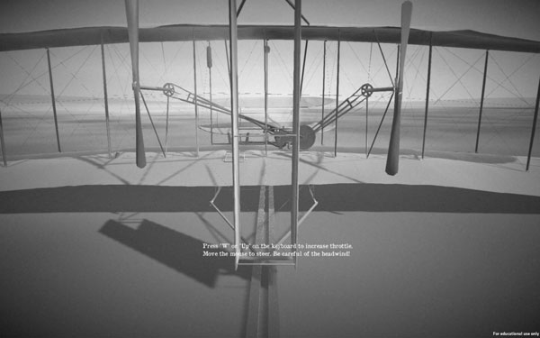
VR or Virtual Reality
Virtual Reality invents its own world. The aviation interactive pictured and linked to above is VR. Most visitors aren’t going to get to fly a real 1903 plane anytime soon, and this gives visitors a chance to experience some of the thrill and/or terror the Wright brothers might have felt. Some VR technologies are fully immersive and make use of goggles or specially designed spaces to fully place the visitor within the invented experience.
Who’s Using This Technology at the Smithsonian?
There are a number of people in museums who use this technology as an interpretive tool, but don’t actually make the technology themselves. When Yayoi Kusama: Infinity Mirrors was open at the Hirshhorn, the museum had a VR version of the mirror rooms developed for visitors who had mobility issues and were unable to walk into the small mirrored rooms. In this case, the technology was driven by visitor services and a desire to make the art accessible to everyone.
At the Renwick Gallery, the upcoming exhibition Reforestation of the Imagination at the Renwick Gallery will use AR technology as an artistic media. This is an example of an artist integrating an AR experience into their artwork.
One example from Smithsonian Exhibits is the bank robbery interactive in The FBI Experience. It uses AR to allow visitors to search for evidence at a crime scene. We developed the story, which explains how the FBI investigates a bank robbery, and designed the exhibition to match the crime scene. We worked with our media partner to make sure that the AR told the same story. This interactive required coordination between exhibition development, design, and media.
So, in short, incorporating AR and VR isn’t necessarily an easy process, but if a project builds in the time to do it right, it can be a fantastic tool within an exhibition
Visitors to The FBI Experience learn how to search a crime scene for evidence in a mock up of a bank that has been robbed. As visitors scan the bank for evidence, they can collect it on screen. The AR triggers additional screens that explain how the evidence is processed and what information can be learned from analyzing it.
Information on touring The FBI Experience is available on their website.
Want to learn more about the projects?
Smithsonian Exhibits designer Maddie Wan organized an Open Talk about VR/AR and her panelists agreed to let us link to their work. Check out our resources page to learn more about projects by:
Cody Coltharp, Digital Interactive Designer, Smithsonian Center for Learning and Digital Access
Diana Marques, Visual Science Communicator
Sara Snyder, Chief of Media and Technology at the Smithsonian American Art Museum
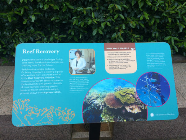
Most of the exhibitions Smithsonian Exhibits (SIE) works on have walls, not to mention a roof. But recently, SIE collaborated with Smithsonian Gardens on an exhibition without either.
Last year, we blogged about an interpretive master plan we did with Smithsonian Gardens for their new Smithsonian-wide exhibition series. Now, the first of those exhibitions—Habitat—is open to visitors (as well as the elements!)
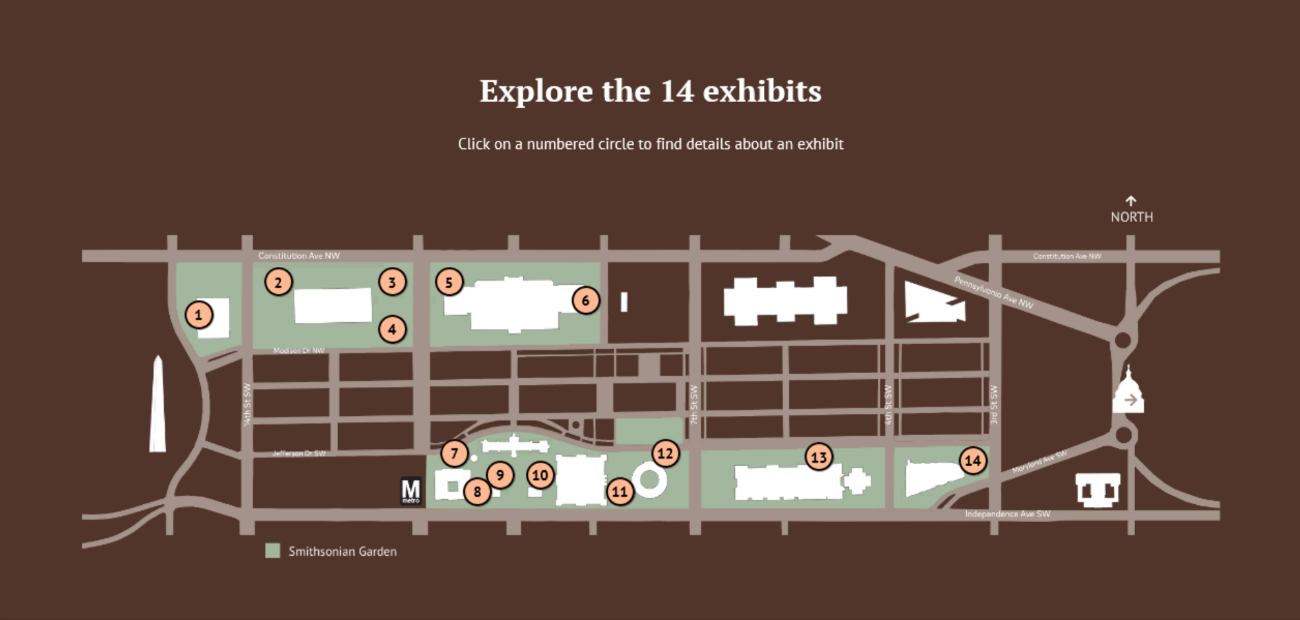
Habitat features 14 exhibits displayed throughout the Smithsonian campus, including exterior and interior garden spaces. Follow the map here to explore them all.
A map showing the locations of the 14 Habitat exhibits. Image courtesy of Smithsonian Gardens.
The exhibits tell diverse stories about habitats and the plants, animals, and humans that call them home. But they all share one big idea: Protecting habitats protects life.
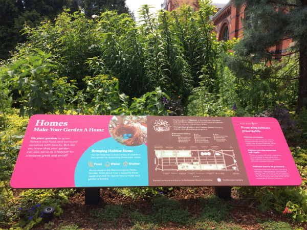
The Homes exhibit in the Mary Livingston Ripley Garden offers tips on how you can transform your garden into a habitat for creatures great and small.
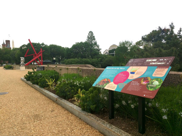
Monarchs on the Move, outside the Hirshhorn Museum and Sculpture Garden, provides a pit stop for migrating monarch butterflies. Image courtesy of Smithsonian Gardens.
SIE assisted Smithsonian Gardens with developing and editing the content, which was designed and produced out of house.
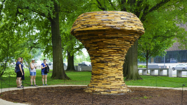
Large-scale sculptures by artist Foon Sham draw visitors into several of the exhibits. Image courtesy of Smithsonian Gardens.
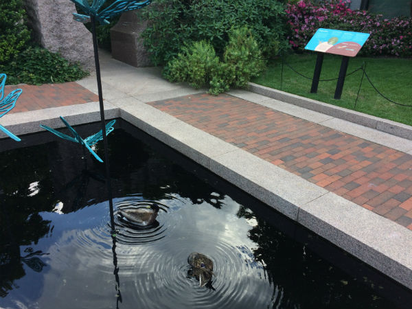
Ducks enjoy their habitat in the Sign of the Dragonfly exhibit in the Enid A. Haupt Garden.
The content team worked closely with Smithsonian curators and other experts to connect each exhibit to its neighboring museum. The result gives visitors a taste of the Smithsonian’s incredible range and diversity before they even set foot inside a museum.
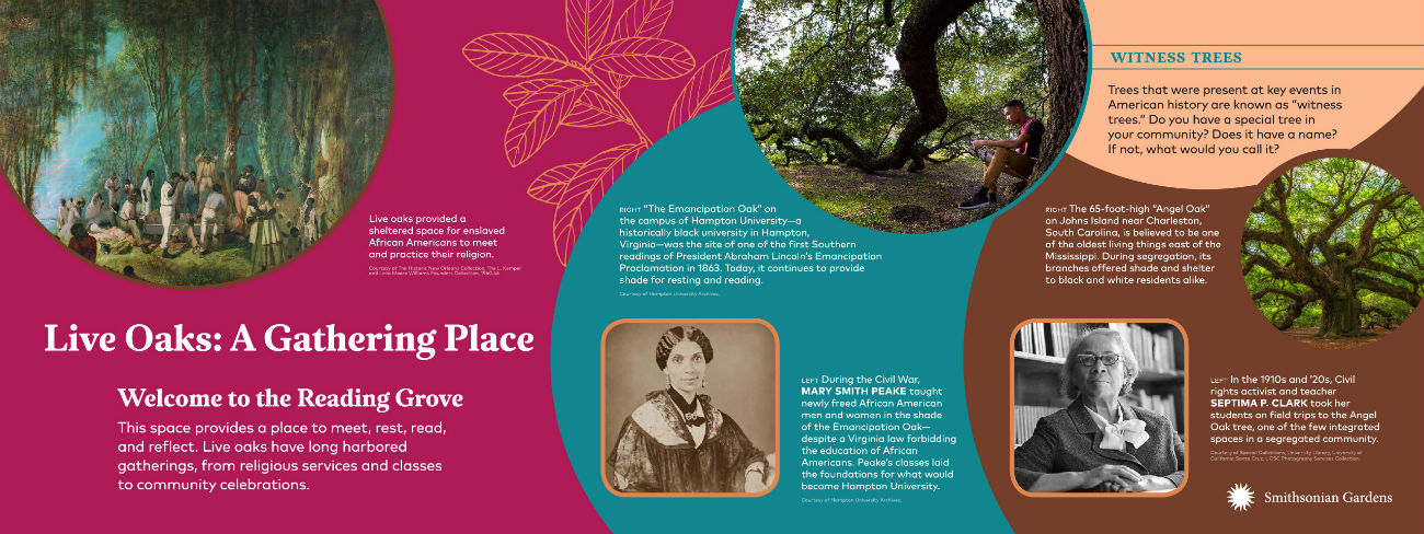
Sheltering Branches, outside the National Museum of African American History and Culture, explores the important roles live oaks play both as a habitat and as a symbol of strength and resilience. Image courtesy of Smithsonian Gardens.
Several of the exhibits highlight the important work of Smithsonian scientists and conservationists and how you can help protect habitats.
So this summer, enjoy the great outdoors while taking in this great exhibition. Just remember to bring the sunscreen!