Home » Archives for Brigid Laurie

Author: Brigid Laurie

Comic panels about collecting African American History for the National Museum of African American History and Culture

Birthday Comic

Happy Birthday to Us!

Okay, so a little early—our actual birthday is August 10—but it’s been a weird year and if we want our cake and comics a little early, so be it.

This year, the Smithsonian turns the big 1-7-5! Which according to my notes … is well past human lifespans so I get to make up the traditional gift. I’m going with cake and comics, which works for two reasons:

  1. Cake is a timeless birthday tradition in the U.S. (Also, I really want to work on an exhibit about cake, so if anyone out there is in the position to make that happen, please email me. Thanks!)
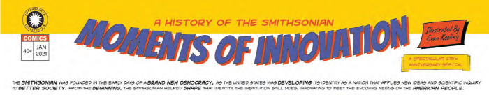
  2. SIE’s very own Evan Keeling was asked to create a birthday comic for the Smithsonian. It appeared in Impact magazine but you can see it here.  (Also, please note that the version in the link is accessible to those using screen readers.)

Title line of the comic

Impact is written by a team at the Smithsonian’s Office of Advancement. The magazine is for a range of donors and volunteers across Smithsonian’s museums, research centers and the National Zoo. It gives readers a sneak peek into stories they might not have otherwise known. An audience that is just learning about us for the first time would likely have the usual questions:

Okay, I don’t think anyone is asking that last one all that often, but it’s a great bit of trivia you can use to impress your friends.

An audience that’s already visiting and supporting the Smithsonian regularly probably had a chance to get those answers before. The Impact group wanted something that would, well, have a little more impact for their readers.

Highlighting Moments Instead of Dates

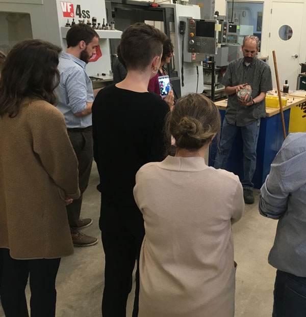
Elise Walter, one of the writers in Advancement, saw Evan give a presentation about how to effectively use comics as a storytelling device at our Open House in 2019. She already knew that Advancement wanted something a little different for the 175th anniversary. Using a comic would let them highlight individual moments of Smithsonian history and let each story take on its own point of view.

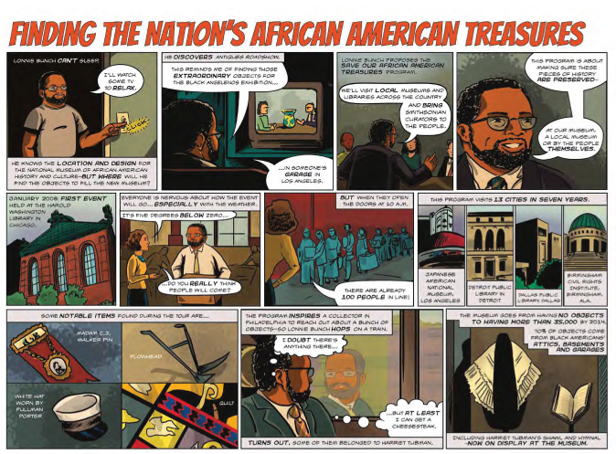
Elise enlisted Pam Henson at the Smithsonian Archives to help select stories that could be developed into comic panels. As they chased down the best stories for the comic, they knew they wanted to find some of the more obscure bits of Smithsonian history.
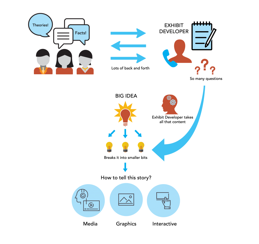
Visual Storytelling

The selected stories were interesting—real hidden gems of the Smithsonian. But were they visually compelling? They consulted with Evan throughout the process, who helped them determine what stories would work in a visual way, and what characters could pull a reader in. Different stories required different points of view. Some comics needed multiple panels; some stories benefitted from one larger panel to represent the outcome. Comics can be used to achieve numerous types of storytelling in the same publication, as the examples below show.

Playing with Perspective

A comic panel about the scientific impact of Florence August Merriam and Vernon Bailey.

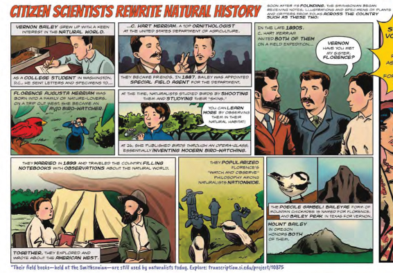
The comic about Florence August Merriam and Vernon Bailey shows how the 19th century science power couple completely changed the study of birds. The literal bird-eye views show the birds up close and the observers far below them. This emphasizes their approach to studying birds—one that radically changed the field and invented modern birdwatching.

Highlighting the Result

TA comic panel showing three inauguration gowns worn by First Ladies.
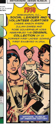
he story of how the First Ladies’ gowns were collected for the National Museum of American history is an interesting story—but the strongest way to show it visually is by their success. Showing a bunch of people in conversation over and over isn’t nearly as fun as looking at three of the gowns.


Introducing Complicated Topics

comic panel about the National Museum of the American Indian Cultural Resources Center

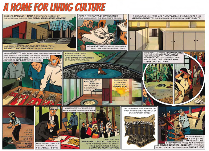
Comics can take a complex topic and make it easier to understand. Illustrating the story of the NMAI Cultural Resources Center makes the it easier for readers to learn how this unique facility works.

First-Person Storytelling

Comic panels about collecting African American History for the National Museum of African American History and Culture

The speech and thought bubbles used in comics let a specific narrator explain (or think through) tough problems. The reader gets to see how a main character approaches a situation.


Be sure to check out the entire comic (here’s that link again) to see more moments of innovation!


A blue graphic with white lettering and yellow icons welcomes visitors to the National Zoo. It lists the requirements for staying six feet apart, wearing a face covering, and washing hands/using hand sanitizer; the graphic is in a black metal frame; the graphic can swing in the breeze to prevent the wind from knocking it over

Looking for Signs

In these uncertain times (I had to start with that for my professional writer pandemic bingo card), we are all looking for signs. Signs that things are getting better. Signs that we will actually love the new normal. Signs that we can start doing some of those things we took for granted before.

For SIE, some of our signs are actual signs.

A blue graphic with white lettering and yellow icons welcomes visitors to the National Zoo. It lists the requirements for staying six feet apart, wearing a face covering, presenting a timed entry pass, and to prepare for a bag check. The graphic is in a black metal frame; the graphic can swing in the breeze to prevent the wind from knocking it over
A welcome graphic greets visitors to Smithsonian Exhibits’ building in Landover. SIE designed and fabricated the graphics and the metal sign holders.


The New Normal

The Smithsonian recently reopened the National Zoo and the Udvar-Hazy annex of the National Air and Space Museum. (For those of you not in D.C., Udvar-Hazy is the museum building near Dulles airport.) In order to reopen as safely as possible, the Smithsonian has made some changes to how people can visit these museums. It’s still free to visit, but visitors need timed passes. Visitors over age six need to wear a face covering. Everyone needs to maintain at least six feet of distance.

A blue circle with the words "Please maintain a safe social distance of 6 feet / Favor de mantener una distancia social segura de 6 pies" A womans toes are visible below the graphic.
Signs on the pathways at the National Zoo serve as a good reminder to keep socially distant.


a series of exit graphics stating "Thank you for visiting. Please continue your Smithsonian journey by visiting us online at si.edu. Stay Safe! / Gracias por vistarnos. Puedes continuar tu recorrido por el Smithsonian en linea, vistando si.edu. Cuidate!
Signs at Udvar-Hazy thank visitors for coming, and create a divide that allows for one-way entry and one-way exit. Signs reminding visitors to maintain six feet of distance dot the side of the path leading into the museum.


Reopening Efforts

This is where Smithsonian Exhibits comes in. We are, first and foremost, here to serve the Smithsonian. Our expertise normally goes into making one of a kind exhibitions, but for this effort we refocused and became the Smithsonian’s one-stop shop for reopening graphics.

Madeline Wan, an SIE graphic designer, developed icons and graphic standards for the reopening effort. Our fabrication team designed and manufactured metal sign holders. The holders suspend the graphic in a frame. (This prevents strong winds from knocking over signs.)

Madeline also created signage catalogs for the Smithsonian museums and stores to use when ordering their signs from us. It’s a win/win/win: It’s easier for the museums to get their signs in place; the Smithsonian as a whole will have consistent signage across all the museums; and that means it will be easier for visitors to navigate the reopened spaces even if some of the pathways through those spaces have changed.

Our project managers have been meeting with the museums as they assess their reopening signage needs. While each museum is responsible for determining their reopening plan, we are glad that we are able to provide this service and make that effort a little easier.


Safety First

And don’t worry, we practice what we preach: SIE has set up our fabrication and graphics shops to maintain distance between colleagues. Everyone is wearing face coverings. In some cases, this isn’t really a change: some of the work requires face covers and respirator masks already.

Those who can work remotely are continuing to do so—because fewer people in the building makes it safer for those who are on-site.

In short, the Smithsonian is taking precautions, and at SIE we are helping each other out however we can both in our spaces and throughout the Institution.


Want to visit?

When you’re ready to spend some time with animals or a space shuttle, we’ll be here. Just remember to wash your hands.


a restroom at the Smithsonian has every other sink blocked off by tape; signs on the mirrors state that the sinks are unavailable in both English and Spanish
Blocking off every other sink helps maintain social distance. And remember, washing your hands is generally a good idea, even in non-pandemic times.


If you’re ready to visit, check out https://www.si.edu/visit for the most up-to-date visitor information and to reserve free timed passes.

If you’re more comfortable waiting a bit longer before venturing to the Smithsonian, https://www.si.edu/ has a variety of online offerings.

infographic showing subject matter experts and the exhibit developer roles in content development

Exhibit Developer: one of those jobs your guidance counselor never mentioned

If you’ve ever wondered why SIE sometimes has longer breaks between blog posts, there’s a very simple and logical reason for that: we aren’t professional bloggers. We have other jobs at SIE, and those responsibilities come first. So, while we love to keep people up-to-date on the blog, working on the exhibits is more important than writing about working on the exhibits.

The blog posts are, for the most part, written by SIE’s exhibit developer/writers.

This is where I realize there’s a pretty good chance that a lot of people reading this are thinking:

What is an exhibit developer?

Well, like a lot of jobs, it really depends on where you work. At SIE the exhibit developers are also writers. In some places, the exhibit developers are also project managers. I’m sure there’s countless combinations out there that museums developed as they figured out what works best for their process. And as always, if you work somewhere small, the position descriptions get to be somewhat all encompassing. One of my earlier jobs included (among many other things) exhibit research, script writing, bookkeeping, and on Thursday it was my day to take out the trash. My point is, there’s no one-size-fits-all exhibit developer job description.

Because the SIE exhibit developers are also writer/editors, we have a variety of projects that come our way. Everything from copyediting completed scripts to developing and writing an entire exhibit from the ground up. But most people have a sense of what a writer does … for example … this thing you’re reading now? I wrote it.

Exhibit developers, however, are one of those jobs that probably didn’t come up with your high school guidance counselor. I ended up in this field and I didn’t know it was a job until I was in an internship in college.

There are a few key roles, though, that I think define exhibit developers at SIE.


Content Wrangler

infographic showing subject matter experts and the exhibit developer roles in content development
Content Wrangling: We ask to the “dumb” questions so you don’t have to. (Graphic by Madeline Wan)


Exhibit developers are content wranglers. We work with the subject area experts to figure out the best way to tell their story. This way the subject matter expert (for example: historian, chemist, anthropologist, special agent, civil engineer, horticulturalist, etc.) can provide all the information (and review the exhibit script for accuracy), and let the exhibit developers figure out how to turn that into a holistic experience for the museum visitors. Sometimes that means we do some of the research, other times, someone hands over source material. Most of the time it falls somewhere in between. There’s always a lot of back and forth with the content experts as we figure out ways to explain what they know to an audience unfamiliar with the topic.


Script Editor / Writer

infographic showing script editing
Scripts: We help get the text into an easy to understand format … or write the whole thing if the subject matter experts don’t want to. (Graphic by Madeline Wan)


At SIE, we might help edit the script, or in some projects, like The FBI Experience or Mission: DIA, we write it ourselves. We also have to keep in mind that visitors might not know much about the topic. Museum writing is different than writing an article or a book. We need to write in a way that is understandable in more than one order. The main thing to consider when writing for an exhibition is that museums are a spatially driven experience. Visitors move through an exhibition. Museums aren’t textbooks (for a lot of reasons) but let’s concentrate on the order of information for now. In a textbook, it’s fair to assume that the reader will read the chapters in order. By chapter 4, the author can expect that the reader at least glanced at chapters 1 through 3. Exhibitions work more like an anthology: the ideas are all connected, but if you skip around, it should still make sense.

We still make sections clear so visitors can see when they are moving into a new topic. But, while a building’s design might dictate how a visitor gets from one gallery to another, there is no way to guarantee that a visitor will go through the space in any particular order (and even if they do, they might not have a chance to read everything along the way).


Visitor Advocate

an exhibit developer worries about the many wants and needs of visitors
We  you, visitors. You’re always on our minds. (Graphic by Madeline Wan)


We think about visitors. A lot. We heart you, visitors. We try figure out how a visitor would navigate an exhibit. Would they likely follow it in an order? Is there a place where they might have to wait (for example, at an interactive element)? What if that went through it and only looked at the objects? Could they still get a positive experience? What if they only looked at the pictures and read the titles and captions?

Ideally, we like to think that visitors will read everything, and do every interactive, and watch every video clip. But we also live in the real world and understand that sometimes the kids are just done and you have to leave. Or you were lucky enough to have an extra 30 minutes one day and popped into a Smithsonian and just wanted to see something you hadn’t seen before. We want you to engage with the exhibit however works best for you on that visit. Walking into a gallery, sitting on a bench, and enjoying one piece of art is a fantastic way to experience a museum. So is reading every panel if that’s what you want to do. Museums are for everyone, and exhibit developers want you to have an experience that works for you.

Also, we want to make sure you know where the bathroom is and where you can get a coffee. We’re people, too, and we also need those things.

Those are the highlights of the job, but as with any job those “duties as assigned” always come into play. Sometimes it’s a little extra help editing a press release, or maybe we’ll help select images since we’re the ones immersed in the story. But no matter what, exhibit developers want you to enjoy your time in our museums, learn a cool fact or two, and—if we’ve really nailed it—look at an object, story, topic, or (dare I hope) the world in a different way.


DECLASSIFIED! Mission: DIA Continues

Remember that time SIE got to work on all that top-secret stuff (only without getting to learn any of the actual secret parts)? I mentioned that our work on the Defense Intelligence Agency Museum was going to be done in a number of phases. Previously, I wrote about Phases 1 and 2. Now, we’re able to talk about Phase 3. And I promise to continue with the utmost honesty about this project that may or may not REDACTED REDACTEDs—similar to my previous REDACTEDREDACTED post.


Phase 3 was a big one, roughly four times the size of phase 2. The four sections—Supporting Operations, Bringing Them Home, Enabling Diplomacy, and Staying Ahead— explore critical aspects of the DIA’s mission. Each section uses specific examples to explain how complicated missions came together, although REDACTEDREDACTEDfrom those REDACTEDREDACTEDREDACTED. By highlighting specific stories,REDACTEDREDACTED we could show the breadth of the agency’s work without overwhelming visitors with a play-by-play of everything they’ve done since the 1960s.


Supporting Operations

Supporting Operations explores DIA’s role as the provider of military intelligence necessary for operations to occur. Specifically, the exhibit dives into operations during the 1991 Gulf War, Operation Iraqi Freedom, and efforts in Afghanistan. REDACTEDREDACTEDREDACTED.

pixelated photo with the word "classified" stamped on it
What an amazing photo! It perfectly captures the moment.


Bringing Them Home

Bringing Them Home delves into DIA’s efforts to bring home prisoners of war, those missing in action, and those killed in action. The risk with stories like these is that they are almost too compelling—stories that are this emotional can run risk of being overly sensationalized.

Here, we needed to balance out the drama of the rescues with the often unseen work done by DIA. The intelligence and coordination needed to conduct a rescue mission is what makes those dramatic “made for the movies” moments possible. REDACTED REDACTEDREDACTED. Before someone can rescue an injured soldier, intelligence officers need to figure out where they are, how they can get in and out of the building, how they can assess options in real time, and many other things I’m probably not allowed to know about.  

museum display with two cases and several panels
The Bringing Them Home section includes objects, such as the ones shown in cases here, and graphics designed using photographs and primary documents. SIE developed, designed, built, and installed the exhibition.


Staying Ahead

On a lighter note, you should know that we felt the need, the need for speed. Yes, DIA was responsible for Top Gun. You’re welcome, America.

Staying Ahead focuses on the ways DIA uses technology and innovation. For example, the real-life Top Gun program was developed using intelligence DIA gathered by exploiting Soviet aircraft. One of the digital interactives in this section (created by IMG, a partner in this project who handled the audio-visual materials and digital interactives) allows visitors to explore a Soviet MiG aircraft … and another interactive lets visitors take a quiz that asks “what was in Top Gun and what was in real life?” Fun Fact: the DIA exploited MiGs at area 51, where REDACTED REDACTEDREDACTEDREDACTED. By learning about the strengths and weaknesses of Soviet aircraft, a new flight training program was set up for the U.S. Air Force (known as Red Flag) and the famed program for U.S. Navy (cue Highway to the Danger Zone).


The Staying Ahead section features a silkworm missile, a scud missile, and an aquatic mine that the DIA exploited as part of an intelligence strategy of staying at least one generation of technology ahead of adversaries. FUN FACT: if you are installing full size missiles, you pretty much have to design that entire section around where they physically fit in the building. The reader rail around the scud missile also serves as a barrier. Just because the missile has been deactivated doesn’t mean touching it is a good idea.


Enabling Diplomacy
SIE built a custom triangular case to display a uniform. The case needed to accommodate additional small items and small panels—no easy task when you also have to make sure all of the items are easily viewed and read by visitors. Custom cases were also embedded into the graphic panels for other objects.

The section Enabling Diplomacy tells an often overlooked part of military history—using diplomacy to prevent conflict. Truly, what better way to protect the war fighter than to keep them out of harm’s way in the first place. I was really hoping for some REDACTEDREDACTED.REDACTEDREDACTEDREDACTED or REDACTED. In this section, we looked at treaties, negotiations, and internationalREDACTEDREDACTEDcooperation.

But wait! There’s more! Well… admittedly, that wait is going to take a bit. Phase 4 of Mission: DIA is built and ready to go, but not yet installed. Our install date is classified. (Okay, like everything else, the install date was moved because of the Covid-19 situation, but it sounds so much cooler REDACTEDREDACTEDREDACTED to say it’s classified.)


Until next time, REDACTEDREDACTED REDACTED!


Did That Graphic Just Change?

Have you ever walked past an exhibit graphic that seemed to move? Or maybe the image suddenly shifted? Your eyes weren’t playing tricks on you … the graphic was playing a trick on your eyes.

These types of graphics are known as lenticular prints.

What Are Lenticular Prints?

Today’s lenticulars aren’t the moving image stickers you used to get at the doctor’s office as a kid (or adult—no judgment here). You know the ones: if you swiveled it a bit it looked like She-Ra was raising her sword, or a transformer was … transforming. Well now that same concept makes things that do this:


2D Print, 3D Effect

One of the advantages of lenticulars is that visitors can get a nice pop of 3D or animation without needing any additional equipment. As cool as everyone looks wearing those 3D glasses, it’s a bit of waste to supply those for one panel. Lenticular prints simulate motion and/or dimension using specially fabricated two-dimensional prints.

How do the 2D prints make it look 3D?

It’s called stereoscopy. It’s a visual effect created by providing slightly offset views to both of your eyes at the same time. When your brain mushes (technical term) the two visuals together, you see the combined image with additional depth and volume. In other words, your brain takes Image 1 and Image 2 and turns into a much more awesome optical illusion. To do that, the designer has to interlace the images.

infographic showing how two images are combined into an interlaced graphic

But why doesn’t the interlaced image look, well, terrible? And what’s up with that term “lenticular?”

Lenticular comes from “lens,” meaning something curved that refracts lights. The lens that goes on top of the interlaced graphic is called a lenticular lens. It’s made of a series of curved strips called lenticules. Those curved strips refract the light so that you can only see images from certain angles. So the short answers: it’s called lenticular because it has lenses, and those lenses decode the interlaced image into the “changing” graphic.

the different images can only be seen from one direction because of the lens on top of the graphic

Why use them?

Other than they’re really fun? Lenticular prints add impact to displays of static photographs and other images. They can also create a depth of content. By layering images on top of each other, a lenticular can show a before and after, or a variety of images on a theme in a way that shows shifts. Recently, Smithsonian Libraries worked with SIE to create lenticular prints for their exhibition Magnificent Obsessions: Why We Collect. Visitors could see the image of a prized possession, and then it would shift, showing the collector. Visitors can see a visual connection between the two images, and figure out that the stories behind those two images are intertwined.

Creating a Lenticular Print

The process for creating a lenticular print can be broken down into three phases: design, printing, and mounting.

Phase 1: design

First, decide on the type of lenticular print you would like.

There are three main options to choose from:

  • Flip lenticulars create a smooth transition from one image to another using up to 15 frames (think of a flipbook). This type of lenticular can also be used to display 15 distinct images that change depending on viewing angle.
  • 3D lenticulars are created using specialized 3D photography to simulate dimensionality and depth.
  • “4D” lenticulars include a combination of flip and 3D imagery.


Then establish the viewing distance.

This is critical. Knowing how far away a visitor will be standing determines how the software translates the images when generating the final print. This also determines the appropriate lens material.


Finally, prepare the file.

Depending on the lenticular type, the designer compiles a series of images in a layered Photoshop document, building the lenticular from the bottom up. This means the first layer is the background, and all of the other images are layered on top of the background. The images closest to the background look the farthest away.

The screen shots below show how designer Madeline Wan layered the images to create the Magnificent Obsessions lenticular.

image of natural element
The background image does not have a 3D effect.


""
Next, the book and airship images are layered on top of the background.


""
An image of three people is added on top of the book and airship layer.


""
Images of an aquatic creature and a souvenir from the 1893 World’s Fair go on the next layer.


""
The final layer gets a young boy and a gentleman in a powdered wig.

Then, using specialized graphics software, the designer interlaces the the images.

Phase 2: Printing

The interlaced prints are produced on traditional wide format printers. For the Magnificent Obsessions graphic we used a specialty printing company, Parallax Lenticular Printing, to interlace and produce the final print.

Because the graphic is interlaced, it looks odd at this stage. If, for example, the finished product will be an animation composed of 15 images, the print will resemble 15 separate images that have been run through a paper shredder and then reassembled in the wrong order.

Phase 3: Mounting

The finished print is mounted to a clear plastic sheet with a pattern of lenses designed to pull specific images from the composite image.

Each image strip and lenticule must be aligned perfectly. Their proper alignment is what makes parts of the graphic recede back into the graphic, appear to float off the surface, or shift from one image to another.


""
The lenticular lens is mounted on top of the interlaced graphic. Aligning the lenticules to the segmented images is the most crucial step in the process.
Alternate Method: Combining printing and mounting

In some instances, the graphic can be printed directly to the reverse side of the lenticular film. This skips the often tedious (and sometimes problematic) step of laminating and mounting the interlaced image onto the lens. Going this route eliminates the risk of things like hair and air bubbles messing up the application of the lens. However, this method typically requires a much more complex printing setup, such as a screenprinter or UV Inkjet.


If you want to see Magnificent Obsessions in person—once the Smithsonian reopens—it’s on view at the National Museum of American History’s Dibner Gallery in 1 West. In the meantime, feel free to check out the Smithsonian’s various online resources.


Taking Our Show on the Road: An Exhibit Development Workshop in Argentina

In September, SIE’s exhibit developers Brigid Laurie and John Powell flew to Argentina for a weeklong exhibit development workshop, leaving everyone in the office to fend off rogue commas, dangling participles, and incomplete narratives all by themselves. The horror!


Why did we get to do this?

Back in May, Smithsonian Exhibits (SIE) had the pleasure of hosting a group of Argentinian museum professionals. Our guests were participating in a yearlong cooperative program, Capacity Building for Argentinian Museum and Cultural Heritage Professionals. The program was organized by the Smithsonian, the U.S. Embassy in Argentina, and Argentina’s Dirección Nacional de Museos (DNM). We had a wonderful conversation, exchanged information, and said, “let’s keep this discussion going!”


And the conversation did continue! A few weeks after that first meeting, the Smithsonian’s Office of International Relations and Global Programs (OIR) contacted SIE about offering an exhibit development workshop in Buenos Aires. We (Brigid and John) jumped at the opportunity.


""
Workshop participants pose on the stairs of the U.S. Ambassador’s residence in Buenos Aires.


With a Little Help from Our Friends

Working with OIR, we came up with a full schedule of presentations and activities. In Argentina, we were joined by Magdalena Mieri from the National Museum of American History and Sara De La Torre Berón from OIR, who have been part of the program since it started. Magdalena, one of the program’s mentors, led a session on strategic planning. Sara coordinated the workshop on behalf of OIR and made everything go incredibly smoothly.


Who attended?

Twenty participants attended the workshop from five different museums across Argentina. As you would expect, the museums were all at different points in their projects. Some are opening in the near future; others had just started up when this program began. Additional museum professionals from Buenos Aires also attended when their schedules allowed.


What did we talk about?

The program focused on audience-centered exhibit and program development. With that in mind, we organized each day of the workshop around a larger topic. Each day built on the previous day’s topics.

Day one focused on understanding visitor needs and strategic planning.


two men and two women work at a table in the foreground; other groups are working throughout the room
Participants worked in small groups, discussing long-term goals for their museums and possible ways to implement them.


woman in a white blouse stands in front of a projection of the Spanish words Planificacion Estrategia
Magdalena Mieri leads a session on strategic planning.


We also had an opportunity to visit the nearby Museo Cabildo, where they showed us the prototyping they are doing for an upcoming exhibit.


A bearded man points at a label in an exhibit
Gustavo Alvarez, director of the Museo Cabildo, explains their prototyping process for a new exhibition.


On day two, we met at the residence of the U.S. Ambassador to Argentina, a historic mansion, where we discussed interpretive hierarchies beneath exquisite chandeliers.


A man and woman give a presentation
Why are people wearing headphones? The U.S. embassy provided simultaneous Spanish-English interpretation via headsets. This let everyone participate in the language with which they were most comfortable.


a large piece of paper with colored marker notes in Spanish. arms and legs of the people working on it are visible
Workshop participants chart their big idea and key messages for a new exhibition. Sometimes, even in the fanciest of spaces, the best thing to do is to sprawl out on the floor.


By day three, we were ready to dive into the specifics, and talked about ways to organize exhibit content and how to select different tools and techniques to tell a story. We started day three with a random object exercise to consider all the stories you can tell with one seemingly insignificant object, like a coaster.


A woman draws a chart on a large piece of paper; a man is in the background
Content mapping is a visual way to organize topics. (NOTE: While awkward posture and bad handwriting aren’t a requirement for exhibit developing, they do add a certain flair to presentations.)


Dina Fisman from the DNM led a session on exhibit writing, focusing on how to write for an Argentinian audience. We got to listen to her session (thanks, interpreters!)—it was wonderful and insightful.


a woman points to a screen with the Spanish word "concreto" and tips for writing Spanish museum texts
Dina Fisman leads a session on exhibit writing.


Day four was the last formal day of the workshop. We covered how to take exhibits from concept to completion. We shared some sample documents from our work at SIE and met with participants to discuss a variety of exhibit-related topics.


people sitting on the floor with planning charts in front of them
A group discusses ways to combine two topics within an exhibit.


We capped the day with a public presentation at the Museo Roca. It felt like a fitting end to the workshop and it was great to be able to share our experiences with the larger museum community in Buenos Aires.


a man and a woman sit at a desk in front of a screen with the Spanish title Intercambio Profesional Para Museo e Instituciones Culturales Argentina
Thanks to our simultaneous interpreters we were able to field questions at the end of our presentation.


We spent our last day visiting two different museums in Buenos Aires and learning about their efforts to create visible storage for collections and make museums more accessible.


a Braille and textured orientation map for Museo Casa Yrurtia
The orientation map at Museo Casa Yrurtia incorporates braille and a variety of different textures. The map is intended to be used by all visitors.


We look forward to keeping in touch with our colleagues in Argentina and hearing about their exhibits. It was a wonderful learning experience for us and we can’t wait for our next opportunity to take our show on the road!


Interested in learning more about exhibit development and writing? Check out our guide to exhibit development and our guidelines for label writing.

Even Better Than the Real Thing: Augmented and Virtual Reality

It seems like AR and VR have been hot topics for a while, and for good reason. Oldsters like me tend to point to the young whippersnappers who grew up as digital natives and assume that they want a screen in every exhibition. The thing is, with a good interpretive plan and a digital/media team (in-house or an outside partner) AR and VR can become amazing enhancements that—get this—actually helps the visitors understand the content. When AR and VR are used in conjunction with the exhibition’s design and content development, it’s a bit like an author working with an illustrator: the author tells the story, and the illustrator brings it to life in a different, complementary way.


In other words, while it is fun to watch (and play with) all this wonderful technology, it’s important to consider how to best utilize it. Tech for tech’s sake can be lots fun, but tech as a way to enhance a thoughtful experience can have a real impact. AR and VR can also extend the exhibition experience. Visitors inspired by the exhibition can look for additional resources after they leave the museum, and people unable to visit in person can still use online VR to gain an understanding of the subject.


still image from a virtual reality video of a plane
Want to know how harrowing early flight could be? You can gain a better understanding of the bumpy, rickety, and low altitude start of aviation through interactive experiences.


So, what exactly are reality, AR, and VR?


The terms get thrown around a lot, and if you were watching TV and movies in the 1990s you might remember some particularly misleading (and occasionally outright terrible) fictional versions of these technologies.


icon of an eye

Reality

You probably got this one right (or this has just started a HUGE philosophical debate for you and your friends), but for the sake of this post, reality means the world as it is without anything between you and it.


icon of a mobile phone

AR or Augmented Reality

Augmented Reality puts a new imaginary layer on top of real life. The Skin and Bones app used at the National Museum of Natural History is AR. It puts an overlay of “skin” on the skeletons.


icon of a person wearing goggles

VR or Virtual Reality

Virtual Reality invents its own world. The aviation interactive pictured and linked to above is VR. Most visitors aren’t going to get to fly a real 1903 plane anytime soon, and this gives visitors a chance to experience some of the thrill and/or terror the Wright brothers might have felt. Some VR technologies are fully immersive and make use of goggles or specially designed spaces to fully place the visitor within the invented experience.


Who’s Using This Technology at the Smithsonian?

There are a number of people in museums who use this technology as an interpretive tool, but don’t actually make the technology themselves. When Yayoi Kusama: Infinity Mirrors was open at the Hirshhorn, the museum had a VR version of the mirror rooms developed for visitors who had mobility issues and were unable to walk into the small mirrored rooms. In this case, the technology was driven by visitor services and a desire to make the art accessible to everyone.


At the Renwick Gallery, the upcoming exhibition Reforestation of the Imagination at the Renwick Gallery will use AR technology as an artistic media. This is an example of an artist integrating an AR experience into their artwork.


One example from Smithsonian Exhibits is the bank robbery interactive in The FBI Experience. It uses AR to allow visitors to search for evidence at a crime scene. We developed the story, which explains how the FBI investigates a bank robbery, and designed the exhibition to match the crime scene. We worked with our media partner to make sure that the AR told the same story. This interactive required coordination between exhibition development, design, and media.


So, in short, incorporating AR and VR isn’t necessarily an easy process, but if a project builds in the time to do it right, it can be a fantastic tool within an exhibition


AR screens showing the progression of finding evidence in the bank robbery scene
Visitors to The FBI Experience learn how to search a crime scene for evidence in a mock up of a bank that has been robbed. As visitors scan the bank for evidence, they can collect it on screen. The AR triggers additional screens that explain how the evidence is processed and what information can be learned from analyzing it.


Want to see the examples for yourself?

If you want to see the original Wright Flyer that inspired the VR experience, visit The Wright Brothers and the Invention of the Aerial Age on the second floor of the National Air and Space Museum.


You can use the Skin and Bones app in the Bone Hall on the second floor the National Museum of Natural History.


Reforestation of the Imagination at the Renwick Gallery will open June 28 and run through January 5, 2020.


Information on touring The FBI Experience is available on their website.


Want to learn more about the projects?

Smithsonian Exhibits designer Maddie Wan organized an Open Talk about VR/AR and her panelists agreed to let us link to their work. Check out our resources page to learn more about projects by:

  • Cody Coltharp, Digital Interactive Designer, Smithsonian Center for Learning and Digital Access
  • Diana Marques, Visual Science Communicator
  • Sara Snyder, Chief of Media and Technology at the Smithsonian American Art Museum


Collaborating with Colleagues, International Edition

Last week, Smithsonian Exhibits had a wonderful day hosting a delegation of Argentinian museum professionals for a lively conversation about exhibition development. We’re always happy to talk about exhibitions and learn from our colleagues, and this day was no exception.

Our guests are part of a cooperative program—Capacity Building for Argentinian Museum and Cultural Heritage Professionals—organized by the Smithsonian, the U.S. Embassy in Argentina, and Argentina’s Dirección Nacional de Museos (DNM). Their year-long program included a visit to Washington to meet with a variety of Smithsonian offices. The eleven participants represent five museums and DNM. The Smithsonian’s Office of International Relations and Global Programs organized the group’s stay in Washington and joined in on their visit to Smithsonian Exhibits.

Museum professionals having a conversation while sitting at a conference table
Our international colleagues came from across Argentina, representing various disciplines within the museum field.


Our conversation ran the gamut, from organizing exhibition teams to the best ways to create models. We continued our conversations as we toured our facility in Landover. We met with each of our units, allowing us to get multiple perspectives on a topic. For example, one of our conversations concerned how to best select materials that are cost effective and meet conservation needs for the objects. We were able to start the conversation with design, ask about how those decisions would affect graphic production, and then follow that up with questions about constructing the mounts and the cases.


The one common denominator of our conversations? Collaborate! The more the team works together and keeps communicating throughout exhibit development, design, and fabrication, the better the end results. Since there’s no one-size-fits-all approach to creating an exhibition, many conversations will be had along the way to determine the best options. This applies to how to best engage visitors,  meet conservation needs, and well, pretty much every aspect of the exhibition process. There’s a lot of technology and research out there to make all of the steps happen, but those solutions only work if you talk to your team along the way. That’s a plan that makes sense no matter where your museum calls home.


Of course, as our day came to a close we exchanged business cards and contact information so that we could keep the conversation going. We look forward to many fruitful discussions about best practices and innovative approaches to museum exhibitions with our international colleagues.


a group stands at a table filled with example museum panels made of metal, fabric, and acrylic
Designer Emily Sloat Shaw shows sample prints and discusses material selection as a part of exhibition design.


a group watches as a man shows how a maze interactive works
Chief of Exhibit Planning Todd Kinser demonstrates a prototype of an interactive SIE made for the National Zoo.


""
Graphic specialist Evan Keeling explains the various printing techniques used in our graphics shop.


""
Model maker Carolyn Thome talks about 3D printing while showing the group a model skull.


""
Model maker Chris Hollshwander discusses computer-aided milling.

Go Fish!

It’s hard to believe that Sant Ocean Hall at the National Museum of Natural History is ten years old. It’s somewhat shocking that it hasn’t just always been there—it’s such a prominent and memorable part of the museum—but it also has a fresh feel to it so it feels like it just opened. The secret? Updates! (As well as all that amazing content, objects, etc. that makes people want to come back.)


""
Updating the Sant Ocean Hall with new models, like this giant Caribbean sea anemone sculpted by SIE, keeps the exhibitions feeling fresh. The completed 3D print is on the left. On the right, is a screenshot of the digital sculpture used to create it.


A few years ago, Carolyn Thome from our 3D Studio made a signature model for the Ocean Hall’s Life in One Cubic Foot. More recently, the 3D Studio created a number of fish models to enliven the exhibition space. Carolyn used reference photos to sculpt the digital files to be sent to our 3D printers. This time, however, Carolyn had the opportunity to mentor an intern while she created the Ocean Hall models.

Carole Baldwin, NMNH Curator of Fishes and Chair of the Department of Vertebrate Zoology, and scientists Allen Collins and Michael Vecchione, served as the 3D Studio’s subject matter experts, ensuring the accuracy of the models.


" "
The installation of the new fish models at the Sant Ocean Hall went—wait for it—swimmingly! This model of a scaleless dragonfish shows off its fearsome teeth and bioluminescence.


This project also coincided with the 3D Studio getting a new printer. Our new SLA resin printer can produce very high resolution prints in a variety of resin types. Carolyn and our intern, Willow Collins, familiarized themselves with the new equipment. Willow also learned a new 3D modeling program—by the end of the project she was pretty much an expert in all things fish model. In fact, we were so impressed, that at the end of her internship, Willow was hired on as staff.


" "
Juvenile grey snappers appear to dart in and out of the tree roots in a mangrove forest. The image on the left shows the final installation. The image on the right shows the tiny fish in better detail.


" "
Exhibit specialist and 3D model maker Willow Collins installs one of her creations, a translucent Lamarck’s Carinaria sea snail. The position of the model on the mount, which nearly disappears once the installation is complete, shows how this type of sea snail floats through the water.


DECLASSIFIED!! Mission: DIA

Here’s a tricky one: How do you write exhibit text for a new museum when your content experts have top security clearances and can only share a fraction of their content with you? Mission: DIA offered many tricky and interesting questions. For example: will they tell me about REDACTED REDACTEDREDACTEDREDACTED if I ask really, really nicely? *

Working on a museum about an agency that produces, analyzes, and disseminates military intelligence information creates some interesting workflow protocols. When SIE began working with the Defense Intelligence Agency (DIA) on Mission: DIA, we knew that we’d have to build a museum from scratch because their atrium didn’t have an existing museum space. We knew that we’d work with their historians and other experts to create a museum script that told complicated stories. We knew that the graphics would have to convey complex information. And we knew that there was a lot we didn’t know, weren’t allowed to know, and probably won’t ever get to know.

Our unconventional workflow more or less went as follows. First topics were brainstormed, then discussion would follow. As ideas were suggested and settled on, the DIA historians would determine the exact story they wanted to use, and then go off to confirm that the details needed to tell the story well were cleared for use or could be cleared quickly. And lest you think that SIE got to go through all the super-secret stuff, everything had to be declassified before it came to our office, too.

Reading redacted documents became just another part of my day. Eventually, I started to wonder, is this where they blacked out the REDACTED about REDACTED? Despite my strong desire to find out REDACTEDREDACTEDREDACTED and read up on the REDACTEDREDACTEDREDACTEDREDACTED REDACTED REDACTEDREDACTEDREDACTEDREDACTEDREDACTEDREDACTED the historians I worked with at DIA made sure everything was properly declassed before it reached me and my low (so very, very low) security clearance. (NOTE: I know nothing. I’m not worth kidnapping. Not. At. All.)

Mission: DIA opened its first phase in the summer, and more phases are underway. After vetting, scrubbing, redacting, and whatever else might be required, the photos from the first phase’s opening were released to us. So now, unlike the exhibition’s source material, I can talk about the first phase of the project.

The Mission: DIA project posed a number of challenges, not unlike REDACTEDREDACTEDREDACTED REDACTED REDACTEDREDACTEDREDACTEDREDACTEDREDACTEDREDACTEDREDACTED. One challenge was that there was no existing museum and the exhibition was to be built inside a large open space. This meant the designer had to create a “room within a room” in order for there to even be an exhibition.


Overhead view of the DIA museum.
This overhead view shows off the design, SIE’s fabrication, and the cast figures made by SIE’s 3D Studio. The two people in the foreground are actual people. The “people” in the back corner behind the reader rail are cast figures.


The first section to open, Exposing the Truth, explores DIA’s role in bringing unseen threats to light. The exhibition delves into the escalation of Soviet weapons programs during the Cold War, the Cuban Missile Crisis, catching a spy within the agency, and the H1N1 flu pandemic.


""
DIA’s publication, Soviet Military Power, was an unclassified document meant for the general public. It showed readers specific threats from the Soviet Union. Here, some of the weapons the publication highlighted are displayed with copies of Soviet Military Power’s ten editions.


Three exhibition panels detailing NCMI’s work regarding the H1N1 flu pandemic.
The mission of DIA’s National Center for Medical Intelligence (NCMI) is to predict medical threats and prevent potential infectious outbreaks from impacting the U.S. military and its global allies.


As excited as we are to have the first section open, we look forward to continuing our work on the rest of the museum.

The museum REDACTEDREDACTEDREDACTEDREDACTEDREDACTED REDACTED REDACTED REDACTED REDACTEDREDACTEDREDACTED REDACTED REDACTED REDACTEDREDACTED REDACTEDREDACTED is REDACTED REDACTEDREDACTED open REDACTEDREDACTED. It REDACTED REDACTED REDACTEDREDACTED REDACTED REDACTEDREDACTEDREDACTED REDACTED REDACTED went REDACTEDREDACTEDREDACTED REDACTEDREDACTED REDACTEDREDACTED REDACTED REDACTED REDACTEDREDACTEDREDACTED REDACTEDREDACTEDREDACTEDREDACTED REDACTEDREDACTEDREDACTEDREDACTED REDACTEDREDACTEDREDACTED REDACTED REDACTEDREDACTED REDACTEDREDACTEDREDACTED REDACTEDREDACTED REDACTEDREDACTEDREDACTEDREDACTED REDACTEDREDACTED REDACTEDREDACTED well  REDACTEDREDACTED REDACTED REDACTEDREDACTEDREDACTEDREDACTEDREDACTEDREDACTED REDACTED REDACTED REDACTEDREDACTED REDACTEDREDACTED REDACTEDREDACTEDREDACTED REDACTED REDACTEDREDACTED REDACTED REDACTED REDACTEDREDACTEDREDACTEDREDACTED REDACTEDREDACTED REDACTEDREDACTEDREDACTED REDACTEDREDACTEDREDACTED REDACTEDREDACTEDREDACTED REDACTEDREDACTEDREDACTED!


*No. No, they won’t.