With a new name comes a new logo. That sounds simple enough, but a lot more goes into thoughtful design than changing some typefaces and colors.
Creating a logo —essentially a visual identity— is an unusual challenge. There are many considerations to keep in mind. We started brainstorming the sort of image we wanted to convey last year. After we determined our wants, several needs also had to be addressed in the design process. Our logo needs to work in color and in black and white. It has to have impact as a small icon in the corner of a sheet of paper, but it also needs to look great blown up on an entrance wall. It needs to be a pictographic signature. That’s a really big order for what is often a tiny piece of art.
Okay, so that sounds like a lot of work. And it is. But luckily for us, Smithsonian Exhibits is filled with creative people. We opened up logo design to the entire staff. Including so many people in a design exercise is a bit unorthodox, but this gave everyone a chance to participate in our rebranding. Around Memorial Day, many on staff (even some not in design) submitted logo ideas for consideration.
We reviewed the initial submissions and selected seven concepts for further development.

For the remainder of the summer, our Chief of Design, Eric Christiansen, led a team of designers in refining the potential logos.

As a design direction started to become apparent, the concept began to evolve. Design is rarely a linear path. As ideas are explored, different angles are taken, and different designers have different interpretations.
As our logo project wrapped up, we brought in outside branding consultants to help move us over the final hump. We were able to utilize their expertise to move our design to the next level.
Now we have a logo that meets all of those seemingly impossible requirements.
It looks good in black and white …
![]()
… and grayscale …
![]()
… and color with the text underneath it.
![]()
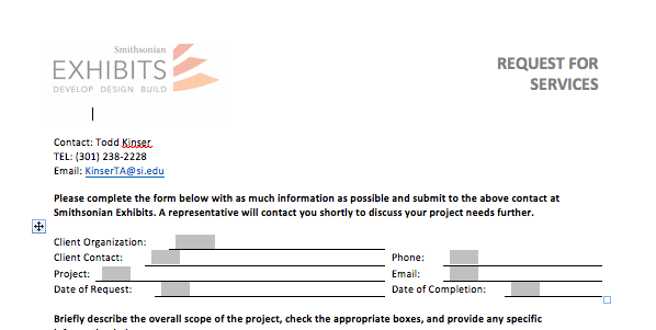
It looks just right on our forms.
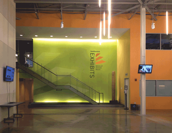
And it really pops on our new entrance wall.
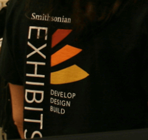
It even looks good on tee shirts and polos.
While the original inspiration for our logo was the letter E, it grew into a form that evokes our mission: saw blades, script pages, a sketchpad, stairs (as we elevate and innovate), rays of the Smithsonian sun, and so on. It’s a veritable Rorschach test, and we couldn’t be happier about that.